Preview image. Unlock full-res
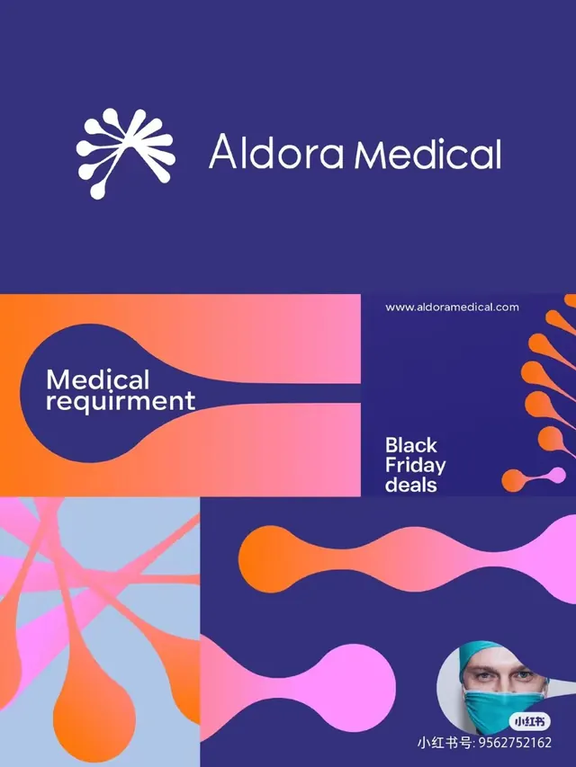
Aldora Medical brand treatment layering a medical network logo with flowing wave-shaped color blocks in deep purple, coral, and bright orange.
Summary
Aldora Medical brand layout layering a stylized network logo with modular color blocks of flowing, organic wave shapes in a deep purple, coral, and orange palette.
Visual description
The composition divides horizontally: a deep purple header spans the top two-thirds with the Aldora Medical wordmark (white sans-serif, right-aligned) and a network-inspired logo (white rounded nodes radiating from center, left). Below, the middle and lower sections stack asymmetric color blocks: a bright orange area containing a dark blue circle with "Medical requirement" text overlaps into a coral pink block labeled "Black Friday deals"; wavy dividers create soft, organic transitions between zones. A lower left abstract pattern (flowing organic shapes in magenta, light blue, and orange on a light blue ground) anchors the lower third, balanced by a right sidebar with wavy shapes. A small avatar and Chinese text (small red number) sit bottom-right.
Key takeaway
Organic wave dividers as soft segment breaks between color blocks, avoiding hard grid lines. The dual-contrast approach: pure block forms (circles, rectangles) against flowing, curved separators creates visual tension and rhythm. The modular stacking lets distinct messages (branding, offer, detail) coexist without competing.
Reuse notes
Strong for healthcare and medical-device branding requiring energy and approachability. The flowing wave vocabulary works in promotional layouts where you need to separate content zones softly without losing clarity. Best paired with san-serif type for legibility in dense compositions.
More like this







Keep what you find
A free account saves references to boards and can send you a weekly email of picks based on what you save.
To see every result, go Pro.