Preview image. Unlock full-res
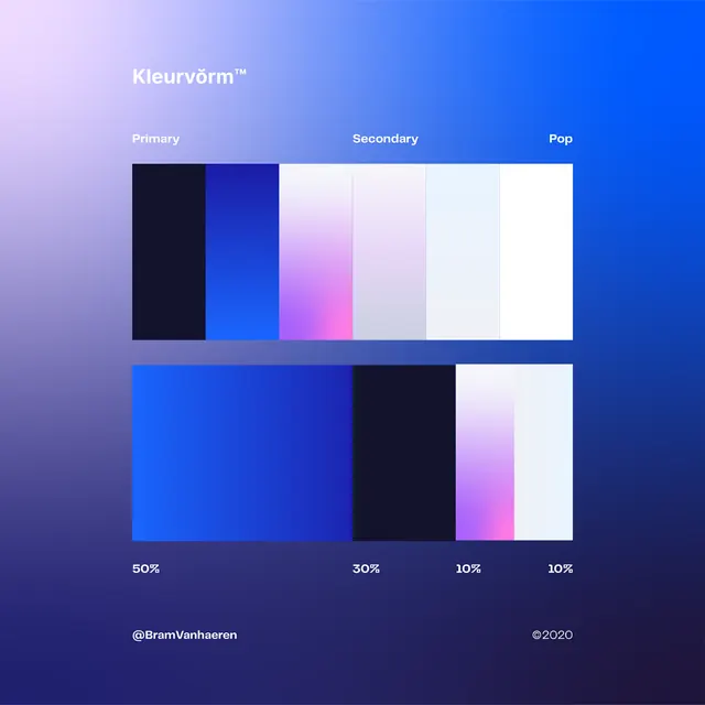
A minimal color-palette composition titled \"Kleurvörm™\" with stacked swatch blocks and percentage labels on a blue-to-purple gradient background.
Summary
A minimal color-palette composition titled "Kleurvörm™" with stacked swatch blocks and percentage labels on a blue-to-purple gradient background.
Visual description
A square poster shows the title "Kleurvörm™" near the upper left over a soft lavender-to-blue gradient field. Below it are two horizontal arrangements of rectangular color swatches, one with labeled sections and one with larger blocks, followed by percentage values and small footer text.
Key takeaway
Use large, clean color blocks with thin divisions to make a palette feel editorial and intentional. Pair the swatches with simple percentage labels and lots of negative space so the composition reads like a designed system rather than a sample sheet.
Reuse notes
This works well for brand color guides, palette studies, and presentation covers where the colors are the subject. Reach for it when you want a restrained layout to make a strong gradient palette feel premium and structured.