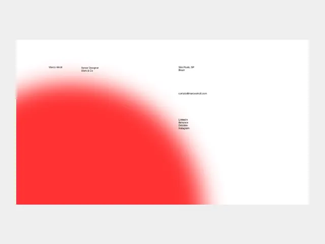
Preview image. Unlock full-res
Minimalist contact layout with a vibrant sweeping red gradient dominating the left third and sparse type treatment centered and right-aligned.
Summary
A horizontal contact/bio card balancing a bold radial red-to-pink gradient occupying the left side with sparse, clean type information (name, title, email, social links) positioned on the right and center.
Visual description
The composition is split by an organic, sweeping radial gradient that starts as vibrant red on the left, transitions through lighter pink mid-frame, and fades toward white on the right. Small clusters of sans-serif text appear scattered but aligned: "Marco Violi" and "Senior Designer" sit upper-left with contact information, location ("Sao Paulo, SP, Brazil") upper-right, email center-right, and a list of social links (LinkedIn, Behance, etc.) lower-right. The overall effect is a modern designer's business card that uses color as the primary visual anchor while typography provides functional hierarchy.
Key takeaway
The gradient mass acting as the entire visual interest, allowing typography to be purely functional and light, and the asymmetric split between shape and type that still feels balanced. The gradient color treatment conveys energy and confidence without any additional imagery or embellishment.
Reuse notes
Strong template for creative professional cards, agency team bios, and portfolio websites prioritizing bold color over photography. Works particularly well when the recipient values the designer's directness and color taste. The red-to-pink palette signals creativity; would need adjustment for corporate or finance audiences. Right-aligned text works best in portrait layouts; horizontal layouts require careful spatial balance.
More like this





Keep what you find
A free account saves references to boards and can send you a weekly email of picks based on what you save.
To see every result, go Pro.