Preview image. Unlock full-res
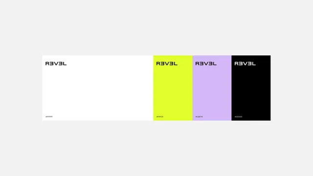
A minimalist brand identity featuring a wordmark and four distinct color blocks.
Summary
A minimalist brand identity featuring a wordmark and four distinct color blocks.
Visual description
The design displays the wordmark 'NAVAL' in a bold, sans-serif typeface across four rectangular blocks. The blocks are colored white, neon yellow, light purple, and black, each featuring the wordmark in a contrasting color.
Key takeaway
The system demonstrates how a consistent wordmark can be adapted across a vibrant, high-contrast color palette.
Reuse notes
Use the color-blocking technique to create distinct sections for different product features or categories.
More like this


Keep what you find
A free account saves references to boards and can send you a weekly email of picks based on what you save.
To see every result, go Pro.