Preview image. Unlock full-res
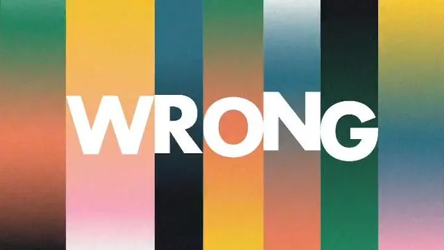
A bold graphic composition of vertical color bands with large white text reading \"WRONG\" across the center.
Summary
A bold graphic composition of vertical color bands with large white text reading "WRONG" across the center.
Visual description
The image shows a full-bleed graphic made of tall vertical bands in different colors, each with a soft gradient and subtle grain texture. Large white sans-serif letters spell "WRONG" across the middle, spanning multiple stripes.
Key takeaway
Use oversized centered type to cut through a rhythmic field of vertical color columns. The soft gradient transitions and grain add depth without cluttering the composition.
Reuse notes
Reach for this when you need a punchy poster-style graphic or a social asset with one dominant word and strong color rhythm. It works well when the message should feel assertive, modern, and visually immediate.