Preview image. Unlock full-res
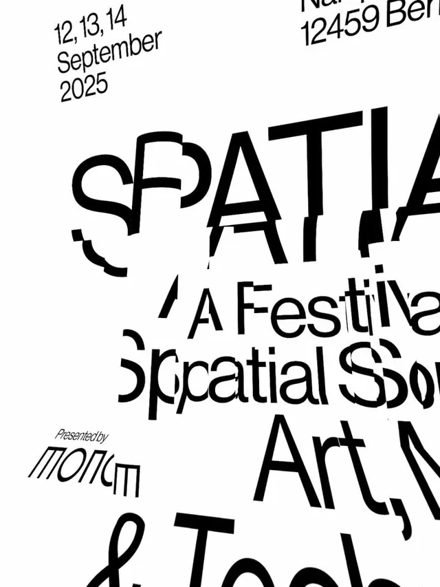
Event poster for a Berlin spatial art festival using heavily distorted, overlapping sans-serif type in black on white, creating dynamic visual chaos through letter warping and irregular stacking.
Summary
Event poster for a spatial art festival featuring heavily warped, overlapping sans-serif type in black on white, with intentional distortion and fragmented letter placement creating visual tension.
Visual description
The poster uses large, aggressive sans-serif letterforms (event title and subtitle text) layered across the composition at varying angles and scales. Individual letters are skewed, sliced, and stretched; some overlap completely while others float isolated. Text density shifts from dense clustering in the center to sparse elements at the top and bottom edges. Small supporting details (dates, organizer credit) sit in regular weight and angle as visual anchors. The pure black-and-white palette with no mid-tones maximizes contrast and emphasizes the geometric distortion as the primary visual language. Negative space is active and asymmetric rather than balanced.
Key takeaway
The idea of using letter distortion itself as a visual effect (not just kerning or scale variation). Skewing, stretching, and slicing individual characters to suggest motion or disruption. The contrast between organized supporting typography and chaotic headline treatment creates hierarchy through visual noise rather than traditional sizing or color.
Reuse notes
Effective for cultural events, experimental art promotion, or gallery announcements where raw energy and contemporary credibility matter more than immediate legibility. Works best in black and white or high-contrast color splits. Avoid for brands requiring trustworthiness or clarity; the intentional distortion reads as deliberate friction and is not suitable for mainstream commercial use.
More like this



Keep what you find
A free account saves references to boards and can send you a weekly email of picks based on what you save.
To see every result, go Pro.