Preview image. Unlock full-res
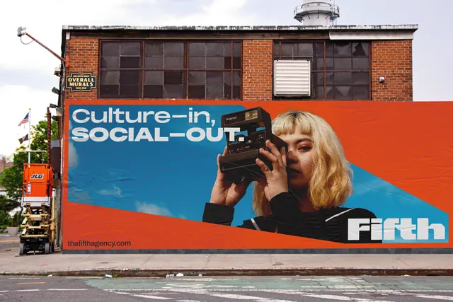
Street-mounted billboard showing a woman with vintage camera against a two-tone background split orange and teal, with sans-serif tagline and brand mark.
Summary
A multi-story brick building wrapped in a billboard featuring a close-up of a blonde woman holding a vintage camera against a diagonal orange-and-teal color split, with white uppercase tagline and a brand logo.
Visual description
The billboard dominates a red-brick industrial building. A photograph of a woman in period dress holding a Brownie camera is positioned centrally against a hard diagonal divide: vibrant orange in the upper right, deep teal blue in the lower left. The photograph is tightly cropped, showing her face and the camera in sharp focus. Overlaid in white sans-serif all-caps: "Culture-in, SOCIAL-OUT." on the left side, and the brand mark "Fifth" anchored lower right. The division of the background color creates an unequal, dynamic composition that emphasizes the diagonal and makes the portrait appear to float between the color zones. A website URL appears in small print. The brick facade of the building is visible above and below the mural.
Key takeaway
The complementary color opposition (orange-teal) creating visual tension and memory-sticking boldness. The use of a hard diagonal to divide color, creating apparent depth and dynamism without layering or shadowing. The portrait acting as a centered pivot that anchors both color zones. The whitespace in the typography making the tagline readable over both colors through weight rather than outline or drop-shadow. The interplay between photorealistic portraiture and flat graphic color zones.
Reuse notes
Highly effective for media, culture, and marketing brands wanting to make an immediate, memorable impact at scale. The portrait + bold tagline formula works well for social campaigns, cultural institutions, and magazines launching new platforms. The orange-teal palette is a proven high-contrast combination for outdoor visibility. Best deployed when the message is punchy and single-focus (not multi-layered). The diagonal composition reads as contemporary and confident rather than dated.
More like this


Keep what you find
A free account saves references to boards and can send you a weekly email of picks based on what you save.
To see every result, go Pro.