Preview image. Unlock full-res
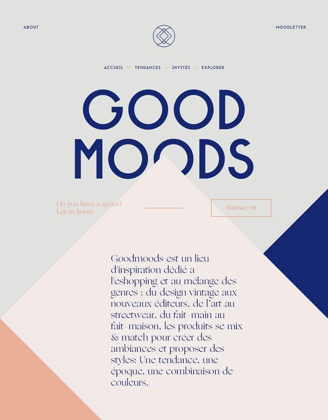
A minimalist poster-like web hero with oversized blue typography, pastel geometric overlays, and a centered navigation layout on a light gray background.
Summary
A minimalist poster-like web hero with oversized blue typography, pastel geometric overlays, and a centered navigation layout on a light gray background.
Visual description
The composition shows a light gray page with small navigation text at the top, a circular emblem centered near the top, and a large two-line headline reading GOOD MOODS in deep blue. Below the headline are a pale peach link line, a bordered contact button, and a large translucent pink diamond shape overlapping the center, with additional blue and peach diagonal color blocks cut into the corners.
Key takeaway
Use one oversized, tightly tracked headline as the main anchor, then layer soft geometric shapes behind and around it to create depth without visual clutter. Keep the rest of the interface sparse so the typography and color blocks do all the work.
Reuse notes
Reach for this when you want a fashion, culture, or editorial landing page to feel polished and art-directed with very few elements. It works best for a single-message hero or poster-style splash screen, not dense content pages.