Preview image. Unlock full-res
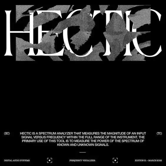
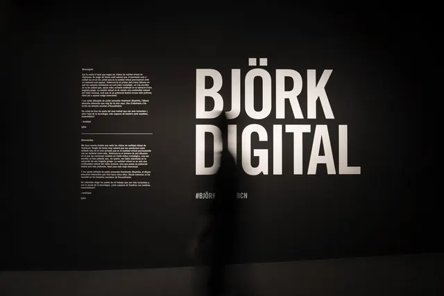
Heavily textured serif letterforms reading HERE with descriptive text below, rendered in stark black-and-white for a technical, industrial aesthetic.
Summary
Heavily textured serif letterforms spelling HERE with dense descriptive text below, rendered in stark black-and-white for a technical, industrial aesthetic.
Visual description
Large serif capitals spelling HERE dominate the upper half of a black background. Each letter is textured with a grainy, weathered surface suggesting age or wear. Below the letterforms, three narrow columns of small descriptive text run the full width, rendered in a delicate sans-serif against the black. The overall composition is symmetrical and centered, creating a formal, archival quality despite the rough, distressed surface treatment of the type. The grain and texture give the piece a hand-printed or gritty mechanical feel.
Key takeaway
The contrast between the bold, large letterforms and the meticulous small-text details below creates visual hierarchy without color or dynamic layout. The distressed texture treatment adds personality to a purely typographic composition. The tight vertical spacing and justified alignment of the supporting text reinforces a technical or scientific tone.
Reuse notes
Strong reference for book covers, academic posters, or technical documentation needing gravitas. The distressed serif style works well for heritage brands, music industry, or anything requiring an authoritative, slightly worn aesthetic. Avoid on soft or consumer-facing designs where the rough texture might read as damaged.
More like this





Keep what you find
A free account saves references to boards and can send you a weekly email of picks based on what you save.
To see every result, go Pro.