Preview image. Unlock full-res
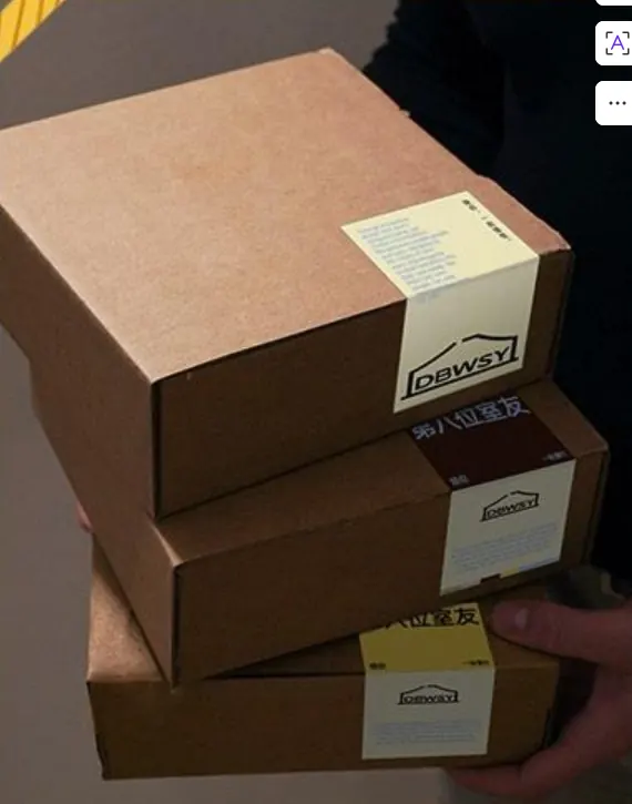
Three kraft paper boxes stacked diagonally with small cream labels, lit by warm studio light to emphasize texture and utilitarian simplicity.
Summary
Three stacked kraft paper boxes arranged at a diagonal, each with a small cream-colored label, photographed in warm studio light to reveal texture and material honesty.
Visual description
Three brown kraft paper boxes are stacked and tilted, creating a dynamic diagonal composition. Each box bears a small rectangular label in off-white or cream positioned near the top-right edge. The lighting is warm and directional, casting soft shadows that emphasize the corrugated texture of the boxes and the subtle depth of the stack. The background is soft, out-of-focus, and neutral. Sans-serif typography on the labels is minimal and legible. The overall palette is warm: kraft tan, cream, browns, and golden highlights where light catches the box edges.
Key takeaway
The diagonal stack as a way to show multiple items or editions while maintaining visual interest. The warm, diffuse lighting technique reveals material texture without looking sterile or overly staged. Minimal label treatment keeps focus on the boxes themselves, suitable for sustainability-forward or craft-oriented brands.
Reuse notes
Ideal for ecommerce, artisan goods, or sustainable packaging concepts. Works well in brand guidelines, product catalogs, or packaging mockup libraries. The warm, natural lighting style reads as authentic and tangible, suitable for unboxing experiences, shipping presentations, or sustainable product positioning. Can feel cliched if the same golden-hour, kraft-box aesthetic is overused in genre.
More like this



Keep what you find
A free account saves references to boards and can send you a weekly email of picks based on what you save.
To see every result, go Pro.