Preview image. Unlock full-res
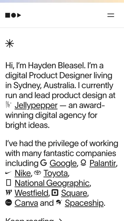
Professional portfolio introduction page with biographical text, client logo grid, and navigation, set in minimal sans-serif on white.
Summary
Portfolio introduction page for a product designer, combining biographical text, client logotype grid, and top navigation into a single vertical layout on white.
Visual description
Top navigation bar with a small logo (three monochromatic geometric shapes) at left and a hamburger menu icon at right. Below, a single asterisk glyph in dark gray serves as visual punctuation. The main content stacks vertically: an introductory paragraph in sans-serif body copy, followed by two lines listing client logos in a horizontal row. The logos are rendered as small black symbols (the Google "G", circle marks, product wordmarks, brand glyphs). A smaller paragraph of body copy flows beneath, continuing the narrative. All text and elements are left-aligned within a centered column, utilizing substantial white margins. Type hierarchy relies on weight and spacing rather than size. The entire composition inhabits the upper half of the visible frame, with blank space below suggesting scrollable content.
Key takeaway
The use of monochromatic client logos (not color brand assets) integrated directly into running copy as trust signals. The restraint to exclude hero imagery or photography, allowing layout and type to carry the design. The top navigation that remains minimal and unobtrusive.
Reuse notes
Strong pattern for designer/agency portfolio pages, product-focused companies introducing team leadership, or SaaS platforms showcasing integrated partners. The sparse, left-aligned layout reads well on both desktop and mobile. Works best when clients are recognizable by simple marks; color logo grids tend to feel noisier.
More like this

Keep what you find
A free account saves references to boards and can send you a weekly email of picks based on what you save.
To see every result, go Pro.