Preview image. Unlock full-res
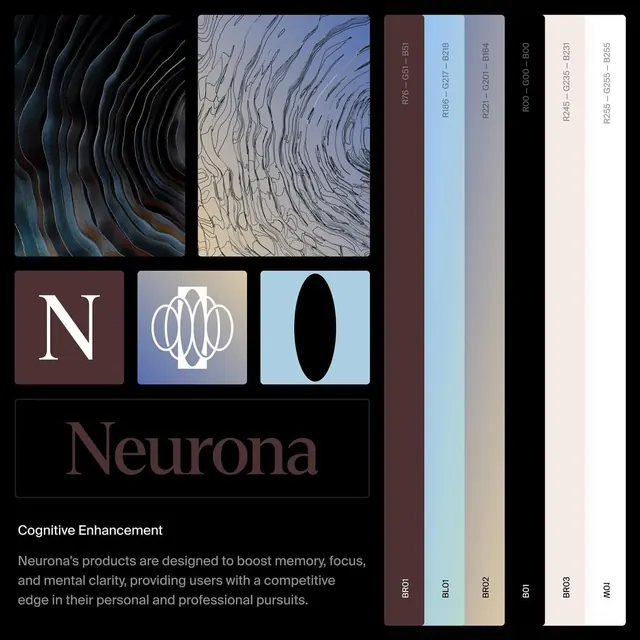
Premium wellness brand identity for Neurona, combining flowing neural-inspired patterns with a structured color palette system and geometric logomarks.
Summary
Premium wellness brand identity for Neurona, combining flowing neural-inspired patterns with a structured color palette system and geometric logomarks.
Visual description
A brand identity presentation showing six design elements arranged in a grid. Top row: two texture-pattern studies, the left featuring dark blue-black flowing ripples, the right in pale blue line-work. Center row: three logomark variations on colored squares (white serif "N" on burgundy, white circular interlocking shapes on blue, black oval silhouette on light blue). Bottom section: a black bar containing "Neurona" in serif type and descriptive copy in body sans-serif, paired with a vertical color-palette guide listing hex codes across deep burgundy, soft blue, warm gray, black, and pale beige swatches.
Key takeaway
The flowing organic patterns establish a distinctive character suggesting neuroscience without being literal. The geometric logomark system is both modern and recognizable. The muted color palette with deep burgundy and soft blue reads as premium and calming, appropriate for wellness and cognitive applications. The structured palette presentation enables consistent application across touchpoints.
Reuse notes
Well-suited for healthcare, wellness, biotech, or cognitive-focused product brands seeking sophisticated visual systems. The neural pattern element works for innovation-forward companies. The reserved color palette suits medical or professional contexts without appearing clinical.
More like this

Keep what you find
A free account saves references to boards and can send you a weekly email of picks based on what you save.
To see every result, go Pro.