Preview image. Unlock full-res
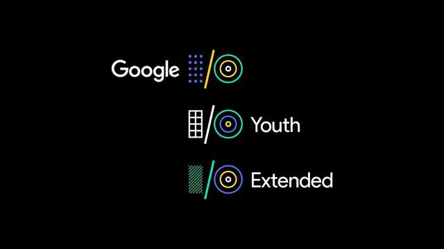
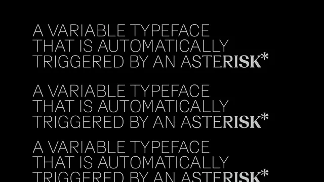
A visual comparison of three different weights and styles of the Google font family, showcasing 'Youth' and 'Extended' variations alongside a standard weight.
Summary
A visual comparison of three different weights and styles of the Google font family, showcasing 'Youth' and 'Extended' variations alongside a standard weight.
Visual description
The image features white text on a black background showing the Google logo and three distinct font weights. Each weight is accompanied by a colorful geometric icon consisting of dots and lines.
Key takeaway
Demonstrates the versatility and weight progression of a specific typeface family.
Reuse notes
Use as a reference for choosing font weights and styles for a cohesive brand identity.
More like this
Keep what you find
A free account saves references to boards and can send you a weekly email of picks based on what you save.
To see every result, go Pro.