Preview image. Unlock full-res
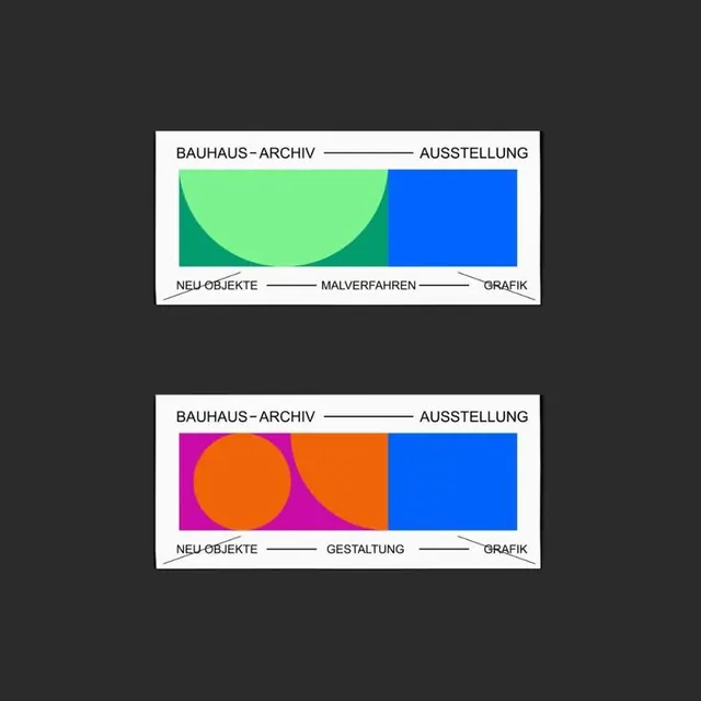
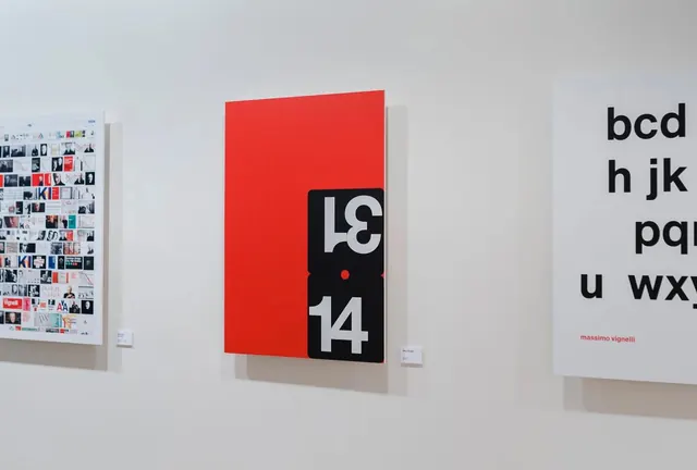
Labeled comparative diagrams in the Bauhaus Archive exhibition style, using geometric color-blocking (mint, magenta, orange, blue) to visualize design categories and relationships.
Summary
Two horizontally aligned exhibition panels showing labeled design taxonomies with bold geometric shapes; Bauhaus-Archive exhibition style using color-blocked rectangles and curves to organize concept relationships.
Visual description
Two white rectangular panels separated by dark gray background space. Each panel contains a horizontal composition divided into three equal color blocks. The top panel pairs a mint-green rounded curve overlapping a bright blue rectangle, labeled Bauhaus-Archiv, Ausstellung (exhibition) at top and Neu Objekte, Malverfahren, Grafik (new objects, painting techniques, graphics) at bottom. The bottom panel shows an orange circle overlapping a magenta rectangle beside a blue field, labeled Bauhaus-Archiv, Ausstellung with Neu Objekte, Gestaltung, Grafik (new objects, design, graphics) below. Connecting lines link labels to their respective color zones. All text is in crisp sans-serif capitals in black.
Key takeaway
The use of geometric shapes (circles and rectangles) to represent conceptual overlap and relationships; the disciplined three-zone color blocking that is simultaneously bold and systematic; and the labeling approach that connects text directly to color zones with simple lines.
Reuse notes
Strong for academic, archival, and museum exhibition contexts. Effective for teaching design history or systems thinking visually. The Bauhaus modernist aesthetic reads as authoritative and timeless. Works best when categories genuinely overlap or relate; adapt the layout for different numbers of zones or relationships.
More like this


Keep what you find
A free account saves references to boards and can send you a weekly email of picks based on what you save.
To see every result, go Pro.