Preview image. Unlock full-res
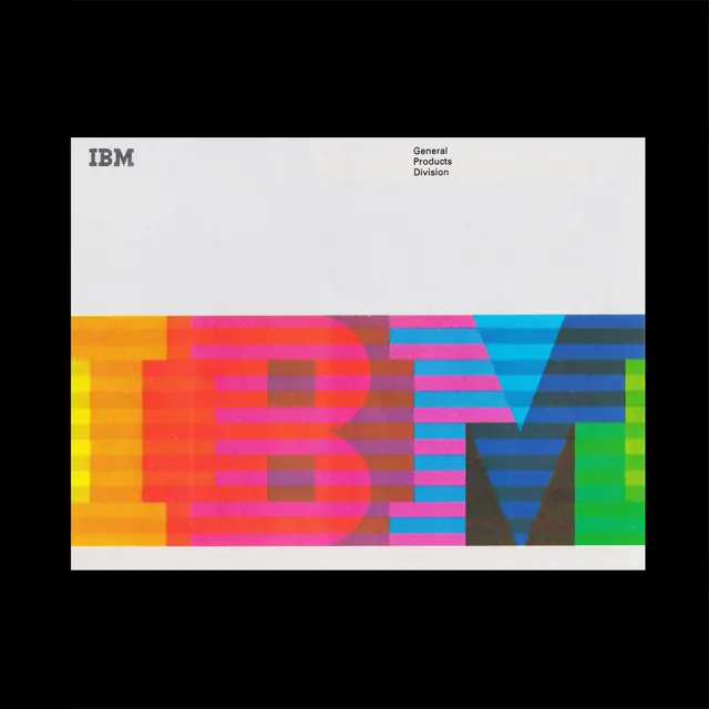
Deconstructed IBM wordmark rendered as interlocking color-blocks in a saturated spectrum palette, paired with organization header.
Summary
A modernist reinterpretation of the IBM corporate mark as interlocking colored rectangles and chevrons, spanning a spectrum from warm orange through cool cyan-to-green.
Visual description
A poster divided into two zones. Top half: white background with "IBM" in a serif font left-aligned, and "General Products Division" in smaller sans-serif on the right. Bottom half: a large horizontal band of color-blocked typography occupying the full width. The letters "IBM" are deconstructed into modular rectangular segments and angled chevron forms, each filled with a saturated color: golden-orange, red, magenta, brown, cyan, blue, navy, and bright green. The shapes overlap and interlock, creating a rhythmic pattern that reads as abstract almost before it reads as letterforms. The geometric precision and high saturation give it a technical, modernist sensibility. Black background surrounds the poster.
Key takeaway
Using color-blocks and geometric shapes to abstract recognizable letterforms into dynamic compositions. The rhythm created by repeating angular forms (rectangles, chevrons) that suggest letters without spelling them literally. Pairing a restrained typographic header with an expressive, saturated lower band for visual contrast.
Reuse notes
Strong reference for corporate rebranding, design system exhibition work, or poster design that celebrates letterform structure. The spectrum color approach reads as both technical and playful. The technique translates well to modular systems (signage, app interfaces) where rigid geometry can be reused. Best impact at poster or large-format scale.
More like this



Keep what you find
A free account saves references to boards and can send you a weekly email of picks based on what you save.
To see every result, go Pro.