Preview image. Unlock full-res
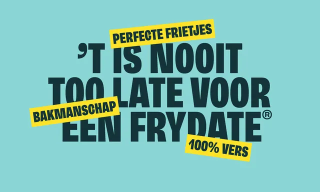
Dutch public health campaign using heavy condensed sans-serif typography in dark teal against a bright turquoise background, with yellow accent bars and layered text creating urgency.
Summary
Dutch public safety campaign using heavy, condensed all-caps sans-serif in dark teal layered over a bright turquoise background with yellow highlight bars to draw attention and create urgency.
Visual description
Light turquoise background filled with large, heavy dark-teal condensed sans-serif letterforms arranged in an overlapping, asymmetrical composition. Yellow bars overlap the text in multiple places, containing additional messaging in white (e.g., "BAKMANSCHAP", "100% VERS"). White text appears selectively in the yellow bars. The layering creates visual tension with headlines, supporting text, and date codes stacked and intersecting across the full canvas. The condensed typeface weight and teal color dominate; the yellow bars break the monochrome with high contrast and draw the eye to key regulatory or safety points.
Key takeaway
The bold condensed typeface as the dominant visual element, eliminating the need for imagery; the asymmetrical layering of overlapping text blocks creating dynamic movement and visual interest; yellow as a strategic accent color within the teal environment to highlight critical messaging; the directness of all-caps, heavyweight sans-serif conveying authority and urgency appropriate to public health communication.
Reuse notes
Powerful for public health campaigns, safety regulations, government announcements, or any context where urgency and regulatory compliance matter. The high-contrast color pairing (turquoise and yellow) is memorable and distinct, avoiding the typical red-white-blue government palette. Best suited for printed posters and large-format displays where the heavy typography can be read from a distance. Not recommended for body-heavy content; this style excels when messaging is short, punchy, and directive.
More like this


Keep what you find
A free account saves references to boards and can send you a weekly email of picks based on what you save.
To see every result, go Pro.