Preview image. Unlock full-res
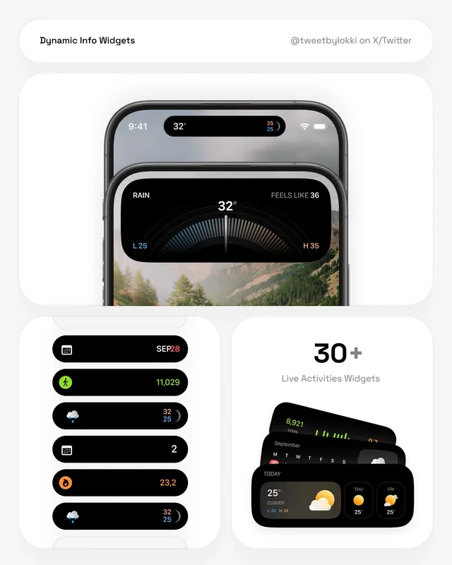
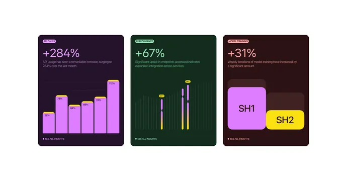
A collection of UI components and data visualizations featuring a dark-themed dashboard aesthetic with rounded elements and high-contrast accents.
Summary
A collection of UI components and data visualizations featuring a dark-themed dashboard aesthetic with rounded elements and high-contrast accents.
Visual description
The design features a dark grey dashboard with rounded corners, displaying a speedometer-style gauge and horizontal progress bars. Accents of neon green and white highlight specific data points and numerical values.
Key takeaway
Uses high-contrast colors and rounded geometric shapes to make complex data easily readable in a dark interface.
Reuse notes
Apply the rounded card containers and high-contrast progress bar styles to other data-heavy dashboard components.
More like this
Keep what you find
A free account saves references to boards and can send you a weekly email of picks based on what you save.
To see every result, go Pro.