Preview image. Unlock full-res
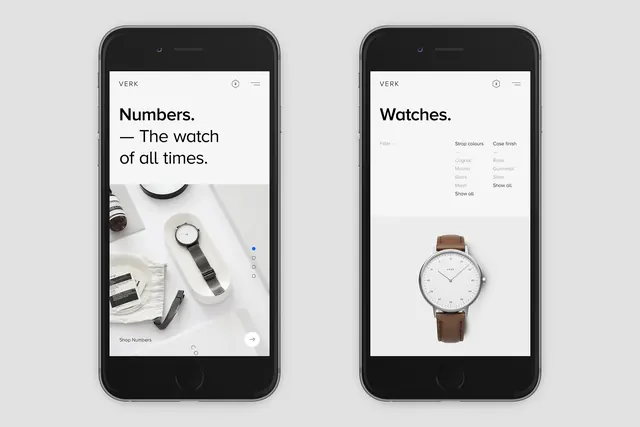
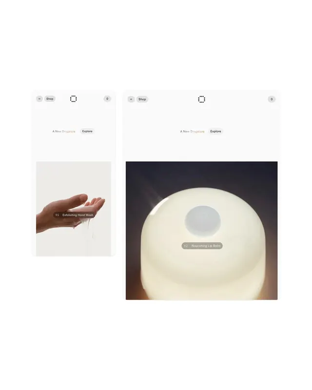
A side-by-side mobile mockup showing two different UI designs for a watch brand, contrasting a lifestyle-heavy layout with a minimalist product focus.
Summary
A side-by-side mobile mockup showing two different UI designs for a watch brand, contrasting a lifestyle-heavy layout with a minimalist product focus.
Visual description
Two smartphone mockups display a watch brand interface. The left screen features a lifestyle photograph of a watch on a table with text, while the right screen shows a centered product image with a clean, white background.
Key takeaway
The design demonstrates how to balance lifestyle imagery with clean product presentation in a mobile commerce context.
Reuse notes
Use as a reference for high-end e-commerce layout structures and minimalist product display.
More like this
Keep what you find
A free account saves references to boards and can send you a weekly email of picks based on what you save.
To see every result, go Pro.