Preview image. Unlock full-res
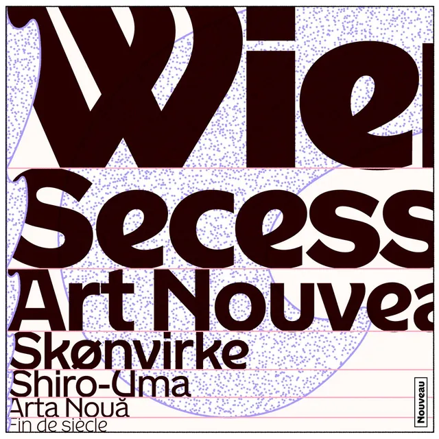
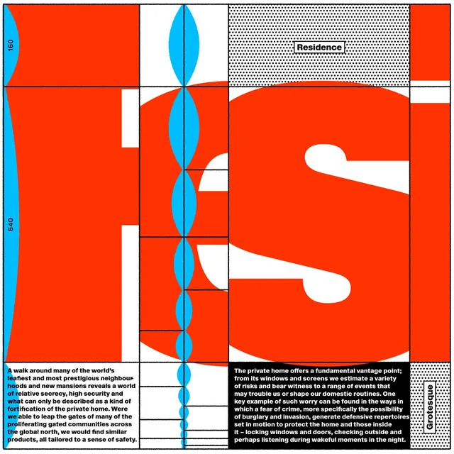
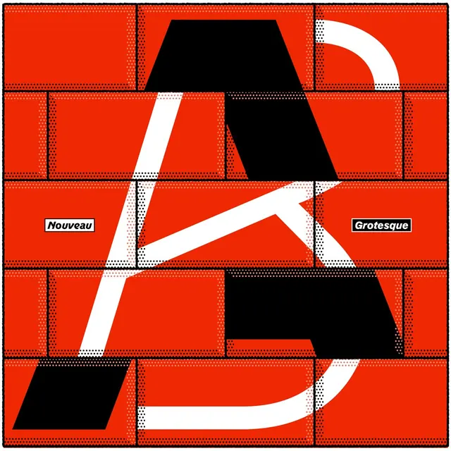
A carousel exploring type design and architectural graphic systems for the Residence typeface with bold red, black, and white graphic treatments.

Summary
A multi-slide carousel exploring graphic design approaches for the Residence typeface release, combining typographic explorations with architectural grids and geometric patterns in a bold red and black color system.
Visual description
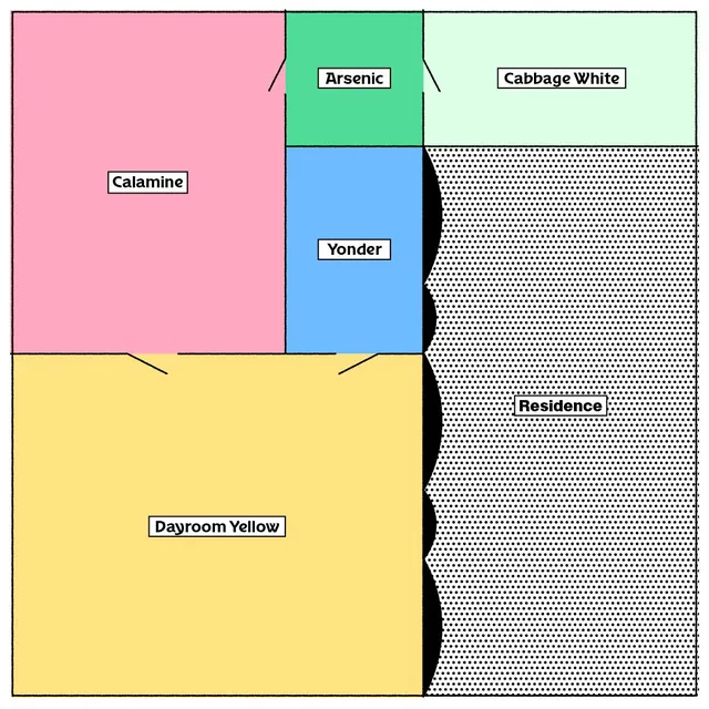
The carousel opens with a bold geometric composition featuring an oversized circular form constructed from thick black lines and white dotted textures on bright red backgrounds, labeled with typeface style names. Subsequent slides layer oversized typography (Nouveau and Grotesque styles), architectural floor plans, brutalist geometric shapes, and dot-pattern fills. The palette alternates between vibrant red and navy backgrounds with black shapes and white negative space. Some slides appear to be pen-plotted on paper (evidenced by line quality), while others are digital compositions. The work demonstrates exploration of how type interacts with grids, patterns, and built environment references. Video elements are present (visible from slide-01 and slide-10 mp4 files).
Key takeaway
The interplay between typographic form and architectural/grid systems as a generative design strategy. Using consistent materials (bold lines, dot patterns, high contrast colors) across multiple explorations to show typeface versatility while maintaining visual coherence through systematic constraints.
Reuse notes
Strong reference for type-driven poster design and graphic systems that break the grid. The red-and-black palette and geometric approach work well for tech, architecture, and creative studio branding. The pen-plot aesthetic references vintage graphic design practices.
From this post: Residence typeface graphic explorations
View post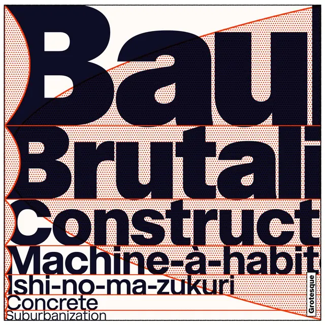

More like this


Keep what you find
A free account saves references to boards and can send you a weekly email of picks based on what you save.
To see every result, go Pro.