Preview image. Unlock full-res
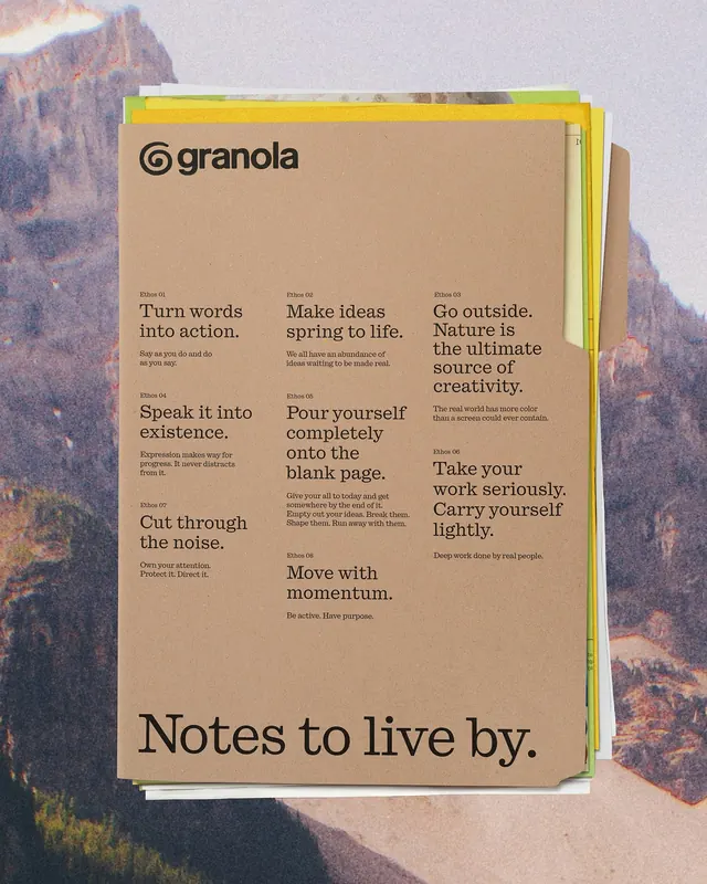
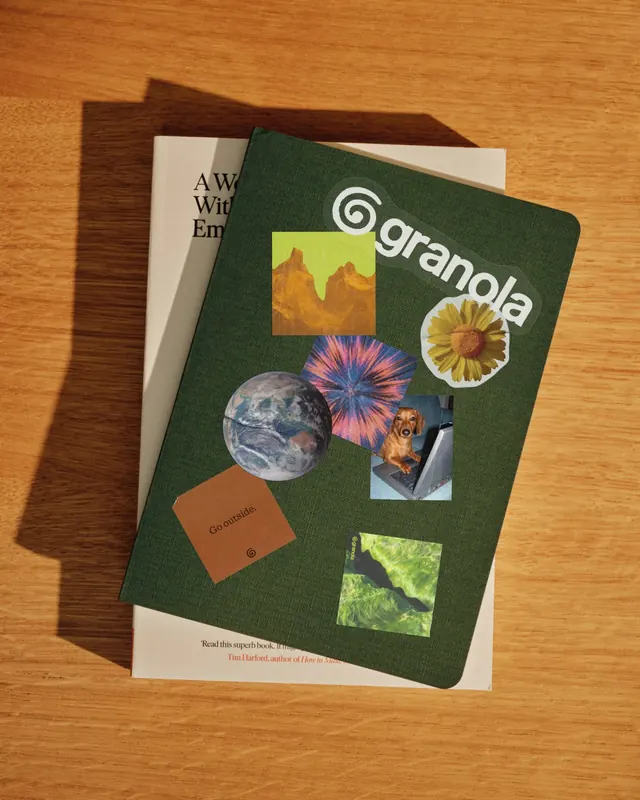
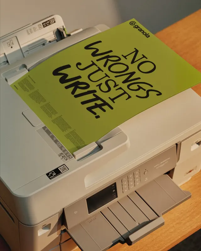
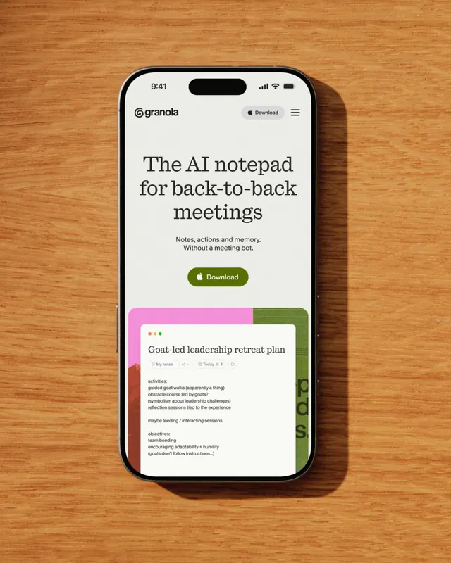
Fifteen-slide carousel presenting a full rebrand of Granola, an AI notepad for knowledge workers, featuring logo, packaging, print collateral, and environmental applications in vibrant lime-green with organic and playful visual language.

Summary
An in-depth rebrand case study for Granola (an AI notepad), showcasing the full visual identity system including logo, packaging, print collateral, environmental graphics, and real-world applications, all unified by a vibrant lime-green palette and organic, human-forward design language that rejects sterile AI aesthetics.
Visual description
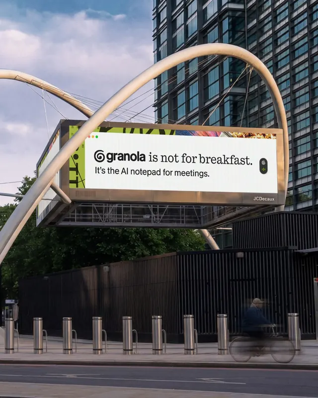
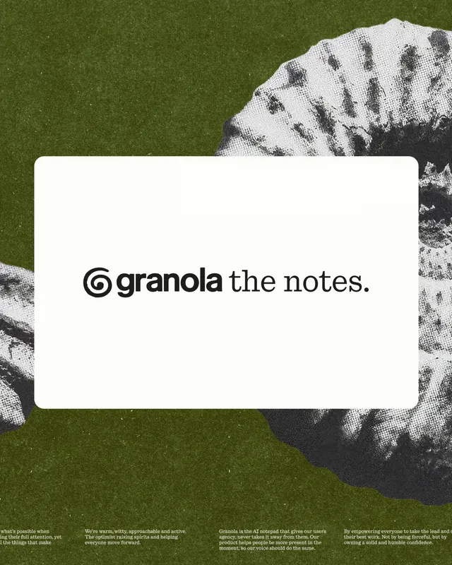
The carousel opens with a lime-green rectangle containing a bold logotype featuring a spiral whorl mark and the word "granola" in dark sans-serif. Subsequent slides reveal packaging mockups with white and lime-green color blocking, diary and journal covers with the spiral motif, editorial spreads with hand-drawn quality typography and geographic coordinates (latitude/longitude) used as design elements, printed posters, print ads featuring the spiral mark, branded collateral like matchbooks or cards, desktop and mobile applications, outdoor billboard installations (including a JCDecaux transit poster), and additional brand system materials. Throughout, the lime-green contrasts with black text, white space, and teal accents. The design language is deliberately imperfect and handmade-feeling, with texture and organic forms replacing the polished minimalism typically associated with AI products.
Key takeaway
The strategic rejection of sterile, over-optimized AI aesthetics in favor of messy, human, and tactile visual language. Using geographic coordinates as functional and conceptual design elements that ground the abstract AI product in real-world places. The consistency of a single dominant color across diverse applications (digital, print, environmental) while maintaining liveliness through typography variation and organic forms.
Reuse notes
Outstanding reference for AI/tech product rebrands that need personality and humanity. Works well for SaaS targeting knowledge workers who value craftsmanship alongside technology. The print-and-environmental design applications are valuable for brands seeking to extend digital identity into physical touchpoints. The coordinate/mapping concept is reusable for location-aware or context-specific products. Best for contexts where breaking visual stereotypes (the "cold AI" look) is a strategic goal.
From this post: Granola AI notepad brand rebrand case study
View post

More like this



Keep what you find
A free account saves references to boards and can send you a weekly email of picks based on what you save.
To see every result, go Pro.