Preview image. Unlock full-res
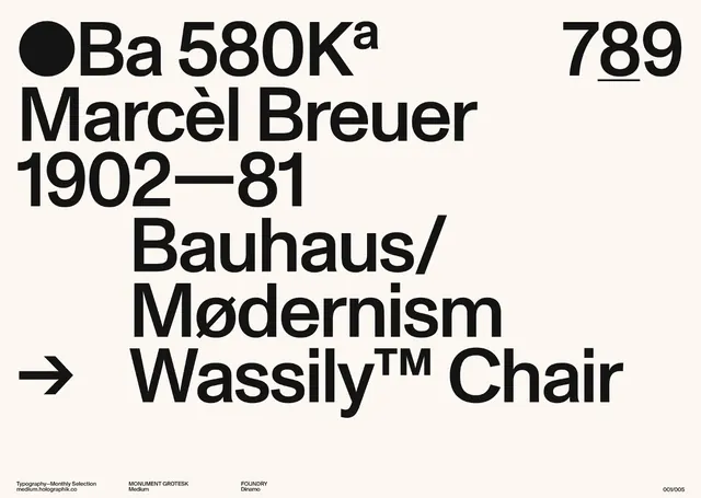
A high-contrast typographic layout featuring historical furniture design information and Bauhaus-inspired aesthetics.
Summary
A high-contrast typographic layout featuring historical furniture design information and Bauhaus-inspired aesthetics.
Visual description
Black text on a white background featuring a bold sans-serif typeface. It includes a large 'Ba 580K' header, a portrait of Marcèl Breuer's dates, and a prominent 'Wassily Chair' label with a directional arrow.
Key takeaway
Uses strict grid alignment and varying font weights to create a clear information hierarchy.
Reuse notes
Apply this high-contrast, grid-based typographic structure for educational content or product specifications.
More like this

Keep what you find
A free account saves references to boards and can send you a weekly email of picks based on what you save.
To see every result, go Pro.