Preview image. Unlock full-res
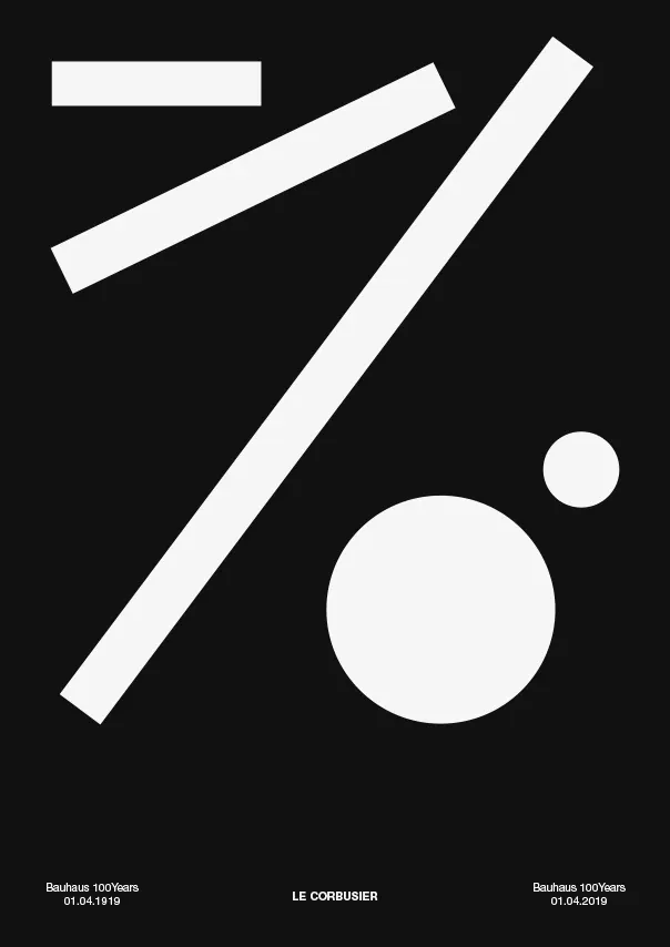
A minimalist, high-contrast graphic composition featuring large geometric shapes and balanced typography.
Summary
A minimalist, high-contrast graphic composition featuring large geometric shapes and balanced typography.
Visual description
A black background features large, light-gray geometric shapes including a rectangle, two long diagonal bars, and two circles of varying sizes. The bottom of the frame contains small, balanced text elements including the name 'LE COURRIER'.
Key takeaway
The design uses scale and geometric abstraction to create a sophisticated, high-impact visual identity.
Reuse notes
Apply this high-contrast geometric approach to posters or brand identity layouts requiring a bold, minimalist aesthetic.
More like this
Keep what you find
A free account saves references to boards and can send you a weekly email of picks based on what you save.
To see every result, go Pro.