Preview image. Unlock full-res
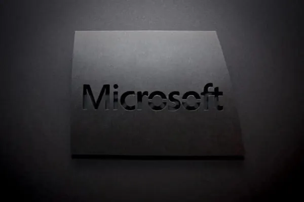
Photograph of the Microsoft wordmark cut out of a matte black panel, lit low so the logo reads only through shadow and edge relief.
Summary
A physical, black-on-black rendering of the Microsoft wordmark: the letters are die-cut from a matte black board so the name appears purely as recessed shadow.
Visual description
A slightly angled matte black panel floats over a darker background, raised enough to cast a soft edge shadow. The sans-serif wordmark is cut clean through the panel, and low raking light from the upper left lets the letterforms read only through the darker void behind the cutout and subtle highlights along the cut edges. The paper surface shows faint grain and speckle, keeping the image tactile rather than digital. No color anywhere; the whole composition lives in a narrow band of near-blacks and grays.
Key takeaway
A logo can survive with zero contrast in hue if material and lighting do the work: cutting the mark out of the surface turns typography into physical shadow. Black-on-black instantly signals premium restraint.
Reuse notes
Reference for dark brand collateral, stealth or premium tech positioning, packaging embosses and die-cuts, and dark-mode identity presentations. The technique needs a strong, simple wordmark and controlled lighting; fine details would clog. Good pairing with dark UI themes and matte material mockups.
More like this


Keep what you find
A free account saves references to boards and can send you a weekly email of picks based on what you save.
To see every result, go Pro.