Preview image. Unlock full-res
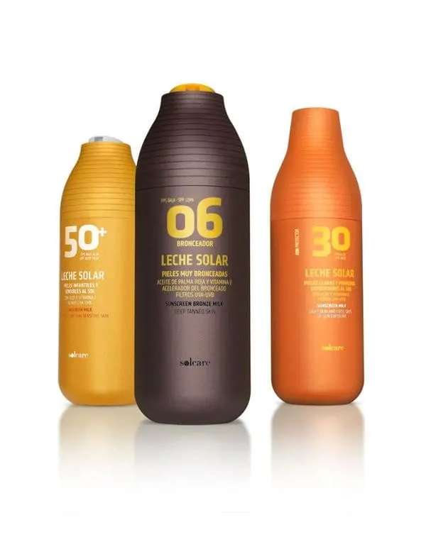
Product shot of three ribbed sunscreen bottles in yellow, brown, and orange, each led by an oversized SPF numeral.
Summary
A studio product shot of a three-bottle sunscreen range where color and one giant SPF numeral do all the shelf communication.
Visual description
Three squat plastic bottles with horizontal ribbed texture stand on a white surface with soft mirror reflections. Left: a mustard-yellow bottle marked "50+"; center, tallest: a dark chocolate-brown bronzer marked "06"; right: a burnt-orange bottle marked "30". Each label stacks a huge numeral over "LECHE SOLAR" and several lines of small all-caps Spanish and English copy, all printed in a single tone-on-tone accent color per bottle. Small script logotype sits near each base.
Key takeaway
Color-coding the entire bottle to its SPF level, then letting one oversized numeral act as the hero, makes the range instantly legible. Tone-on-tone typography keeps the loud colors feeling systematic rather than busy.
Reuse notes
Strong reference for FMCG range architecture where variants must be distinguishable at a glance. The warm sun-tan palette maps naturally to the product story. Pairs well with tactile packaging textures; the tiny support copy needs discipline to stay readable.
More like this





Keep what you find
A free account saves references to boards and can send you a weekly email of picks based on what you save.
To see every result, go Pro.