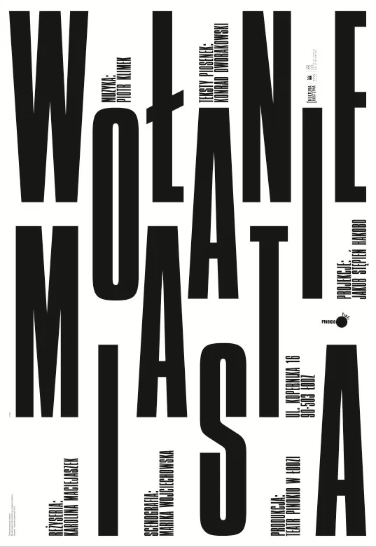
Preview image. Unlock full-res
A high-contrast black and white design showcasing minimal color palette with stark typographic or layout elements.
Summary
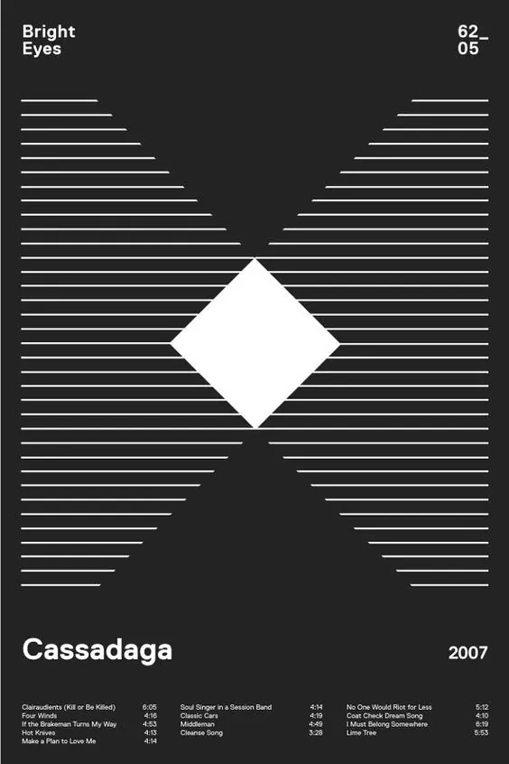
A vertical high-contrast design in pure black and white, demonstrating bold minimalist principles through extreme color reduction to just two values.
Visual description
Vertical composition (537x781) in strict two-color palette: nearly black (#1C1C16) dominates at 54% and near-white (#F5F5F5) at 45%, creating dramatic visual contrast. The nearly equal split between dark and light suggests a deliberately composed layout, possibly with typography or geometric shapes creating the division. The narrow, tall aspect ratio and screenshot-like nature suggest this is a design or typography specimen.
Key takeaway
Extreme color reduction to just black and white can create maximum impact and clarity. The 54-45 split demonstrates how equal contrast distribution maintains visual interest without complexity.
Reuse notes
Excellent reference for high-contrast design systems, minimalist branding, or typography-focused layouts. Works particularly well for bold sans-serif displays, technical documentation, or print work requiring maximum legibility. The monochromatic approach is timeless for professional, editorial, or institutional applications.
More like this

Keep what you find
A free account saves references to boards and can send you a weekly email of picks based on what you save.
To see every result, go Pro.