Preview image. Unlock full-res
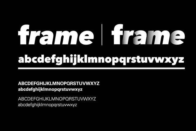
Typeface specimen showing Frame font in multiple weights and styles—regular, bold, italic—displayed on black background with full alphabet samples.
Summary
A typeface specimen displaying Frame font in various weights and case styles, showing full alphabet sequences with clean typographic hierarchy on pure black and white contrast.
Visual description
Black background with white typography. Large headline "frame | frame" at top using bold condensed sans-serif. Below, the full lowercase alphabet in bold weight followed by a ruled line. Further down, four rows of alphabet samples in different combinations: all-caps, lowercase, and italic variations, each pair showing the same text in two weight options.
Key takeaway
Monochromatic high-contrast presentation using consistent sizing and baseline alignment to showcase how a typeface maintains legibility and character across multiple weights and styles.
Reuse notes
Effective for displaying versatile typefaces with multiple weights. The ruled-line divider and organized stacked rows create clear visual separation without color. Works well for font foundry materials or design system documentation.
More like this

Keep what you find
A free account saves references to boards and can send you a weekly email of picks based on what you save.
To see every result, go Pro.