Preview image. Unlock full-res
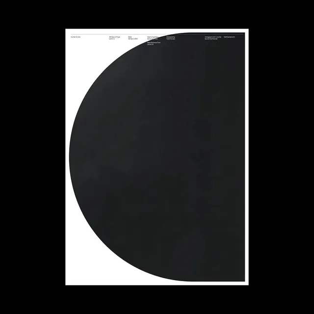
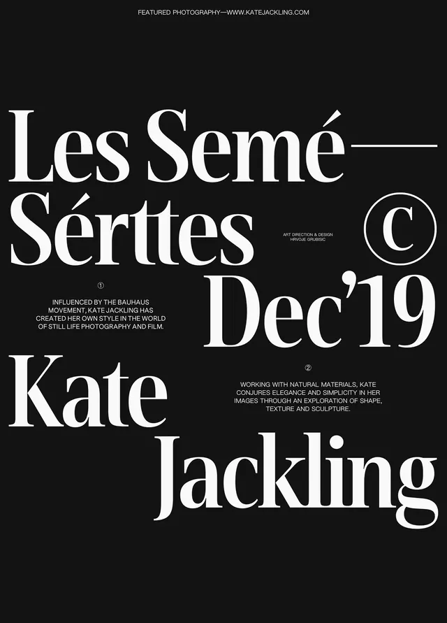
A large-format typography poster featuring a bold, curved black C form dominating a cream background, with small credits and metadata aligned vertically at the top.

Summary
A typographic poster study featuring an oversized black letter C form—bold and organic, with soft rounded edges—anchored against a cream field. Small text at top provides exhibition/artist metadata.
Visual description
Cream background with a dominant, organically-curved black C shape that occupies roughly two-thirds of the vertical composition. The C is defined by smooth, rounded edges with subtle inner curves suggesting depth. At the top-left, a vertical bar of small, tight metadata text in black lists the studio name, date, typeface information, and credits. The layout is asymmetric—the massive form on the right, metadata clustered at the top-left. Clean, minimal approach with no decorative elements beyond the pure form of the letter.
Key takeaway
A single, large letterform can command an entire composition. Asymmetric layout with typography and imagery creates dynamic tension. The curve of the letter itself becomes ornament and content simultaneously. Soft edges soften technical precision, adding warmth.
Reuse notes
Reference for typography-first poster design and "36 Days of Type" challenge entries. Works well for design studio portfolios, conference graphics, or letter/type-focused editorial. The approach (one large letter + credits) applies to alphabetic and character-study campaigns. Scale is critical to the impact—this design requires generous space to read as intended.
More like this
Keep what you find
A free account saves references to boards and can send you a weekly email of picks based on what you save.
To see every result, go Pro.