Preview image. Unlock full-res
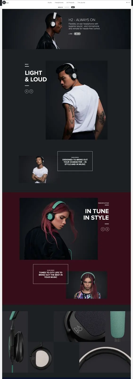
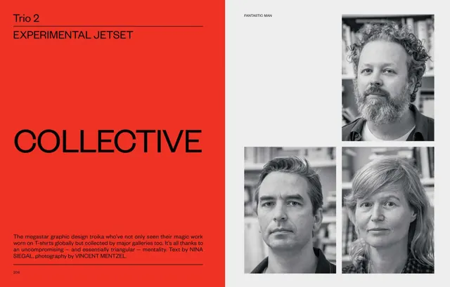
Magazine-style editorial spread balancing typography, whitespace, and asymmetric layout for visual interest.
Summary
Magazine-style editorial spread balancing typography, whitespace, and asymmetric layout for visual interest.
Visual description
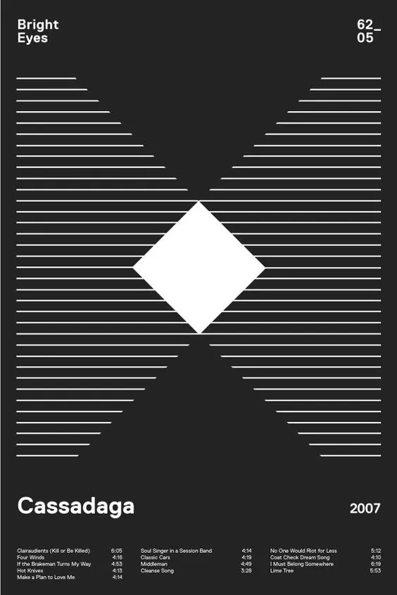
The composition demonstrates strong visual hierarchy through thoughtful use of color, typography, and spacing. The image utilizes dark, monochrome tones to create visual interest while maintaining clarity and focus.
Key takeaway
The strategic application of elegant principles with controlled palette choices creates effective visual communication. The layout demonstrates how editorial spread can balance aesthetics with functionality.
Reuse notes
This item is valuable as a reference for editorial spread design patterns. Consider how the color palette and mood align with your project's tone. Works well for studying editorial, minimal design approaches.
More like this





Keep what you find
A free account saves references to boards and can send you a weekly email of picks based on what you save.
To see every result, go Pro.