Preview image. Unlock full-res
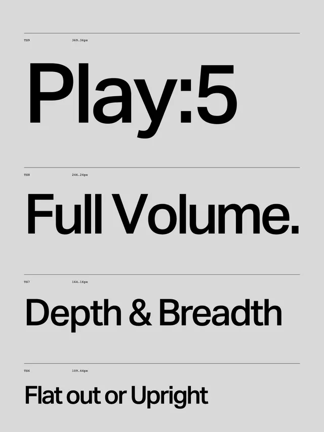
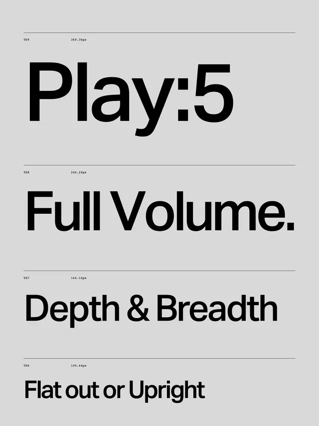
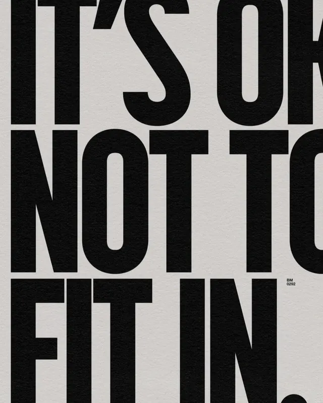
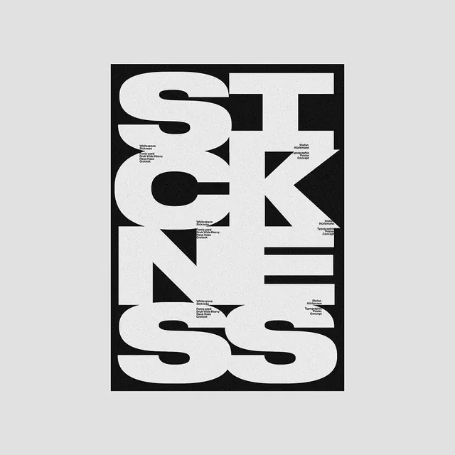
A vertical layout showcasing four distinct typographic expressions with varying weights and styles.
Summary
A vertical layout showcasing four distinct typographic expressions with varying weights and styles.
Visual description
Four lines of text stacked vertically, each featuring a different bold sans-serif typeface. The layout uses a clean grid with thin horizontal dividers and small metadata labels.
Key takeaway
Demonstrates how varying font weights and styles can create a cohesive visual hierarchy in a minimalist layout.
Reuse notes
Use as a reference for high-impact typographic headers or brand identity style guides.
More like this

Keep what you find
A free account saves references to boards and can send you a weekly email of picks based on what you save.
To see every result, go Pro.