Preview image. Unlock full-res
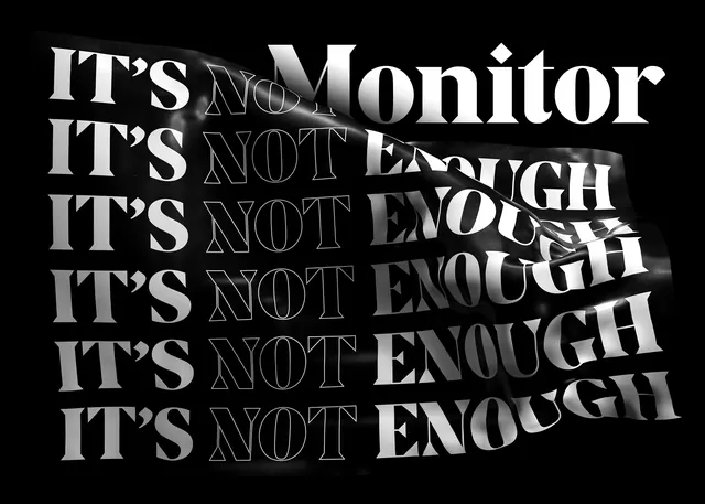
A high-contrast typographic composition featuring repeated text with distorted, liquid-like warping effects.
Summary
A high-contrast typographic composition featuring repeated text with distorted, liquid-like warping effects.
Visual description
The words 'IT'S NOT ENOUGH' are repeated vertically in a bold sans-serif font. A large 'Monitor' wordmark sits at the top, with a liquid, melting distortion effect cutting through the center of the text block.
Key takeaway
Uses aggressive distortion and high-contrast monochrome to create a sense of movement and urgency.
Reuse notes
Apply similar liquid distortion effects to bold headlines for edgy editorial layouts.
More like this

Keep what you find
A free account saves references to boards and can send you a weekly email of picks based on what you save.
To see every result, go Pro.