Preview image. Unlock full-res
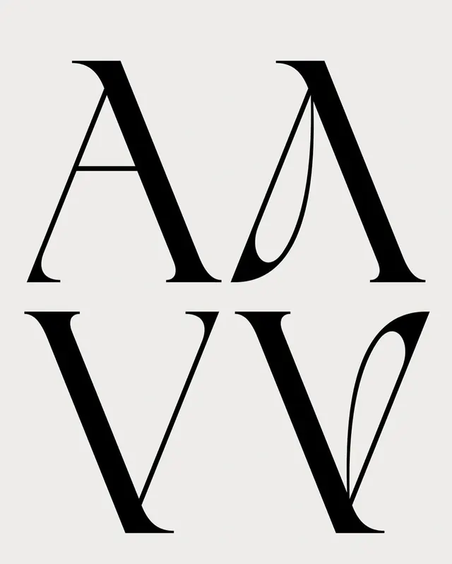
A study of stylized, high-contrast serif letterforms arranged in a grid-like composition.
Tagstypography, lettering, serif, monochrome, abstract
Palette
#EBEBEB
#0A0A0A

Summary
A study of stylized, high-contrast serif letterforms arranged in a grid-like composition.
Visual description
Four large, stylized serif letters (A, M, V, W) are arranged in a 2x2 grid. The characters feature extreme contrast between thick and thin strokes with sharp, pointed terminals.
Key takeaway
The design emphasizes the structural beauty of high-contrast serif typography through scale and negative space.
Reuse notes
Use as a reference for high-fashion branding or editorial layout headers.
More like this

Keep what you find
A free account saves references to boards and can send you a weekly email of picks based on what you save.
To see every result, go Pro.