Preview image. Unlock full-res
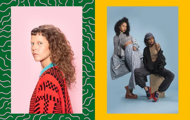
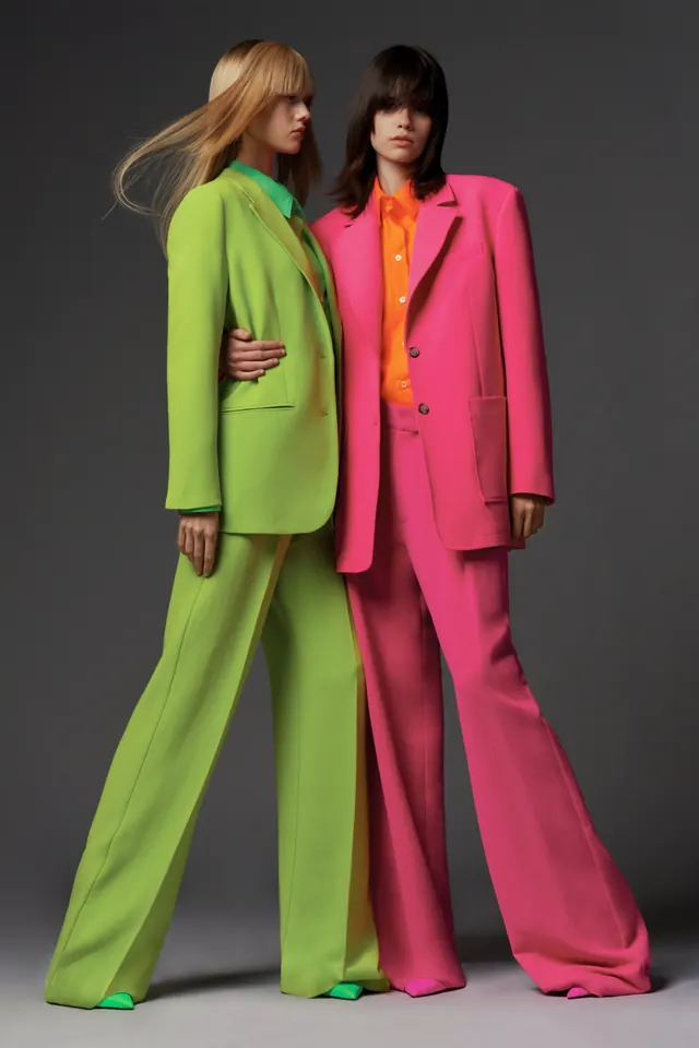
Contemporary editorial layout with two portrait photographs set in high-contrast color-framed panels—one pink with organic green border pattern, one yellow—creating graphic visual impact.
Summary
A bold editorial-layout design pairing two portrait photographs in distinctly colored frames: one portrait set in a soft-pink panel with an organic wavy green-line border pattern, the second in a bright yellow frame against a blue sky, creating striking visual contrast and contemporary graphic energy.
Visual description
The composition splits into two distinct vertical panels. On the left: a profile portrait of a woman with wavy auburn hair and fair complexion against a soft pink background, with a thick border of organic, undulating green lines creating a decorative frame-within-frame. On the right: a full-figure shot of two figures (one standing, one in motion) against a pale blue sky backdrop, all contained within a bright golden-yellow rectangular frame. The juxtaposition of the muted pink + vibrant green against the bright yellow + sky-blue creates high visual impact and contemporary graphic energy. The organic line pattern on the left contrasts with the clean geometric frame on the right. Both photographs are contemporary portraiture—clean, direct, well-lit.
Key takeaway
The dramatic power of bold, unexpected frame colors to elevate vernacular portraiture into graphic art. The complementary color relationships (yellow-blue, pink-green) create perceptual vibrancy and visual tension. The organic pattern on one frame versus geometric frame on the other demonstrates how varied frame treatments can coexist in a unified layout.
Reuse notes
Reference for editorial design, magazine layouts, poster design, or contemporary art direction. Strong inspiration for fashion editorials, identity systems, or marketing collateral for progressive brands. Useful for studying how frame color and pattern can transform simple photography into graphic statement pieces. The color palette and framing technique work well for youth-oriented, creative, or design-focused brands.
More like this

Keep what you find
A free account saves references to boards and can send you a weekly email of picks based on what you save.
To see every result, go Pro.