
Preview image. Unlock full-res
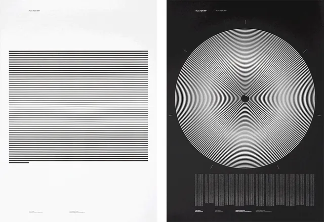
A nearly perfectly balanced monochrome composition dividing the space equally between black and white.
Summary
A nearly perfectly balanced monochrome composition dividing the space equally between black and white.
Visual description
A stark monochrome composition featuring an almost mathematical 50/50 split between pale off-white (near-white) and deep charcoal-black. The division creates a bold graphic impact. The colors are almost perfectly opposite on the value scale, creating maximum contrast with minimal complexity.
Key takeaway
Extreme simplicity and balance in composition. The near-perfect black-white split demonstrates minimalist design principles and can serve as a stark, attention-getting visual element.
Reuse notes
Useful as a foundation for minimal, high-contrast designs. The perfect balance suggests formal, structured design thinking. Works well for dividing spaces or creating stark visual breaks in layouts.
More like this









Keep what you find
A free account saves references to boards and can send you a weekly email of picks based on what you save.
To see every result, go Pro.