Preview image. Unlock full-res
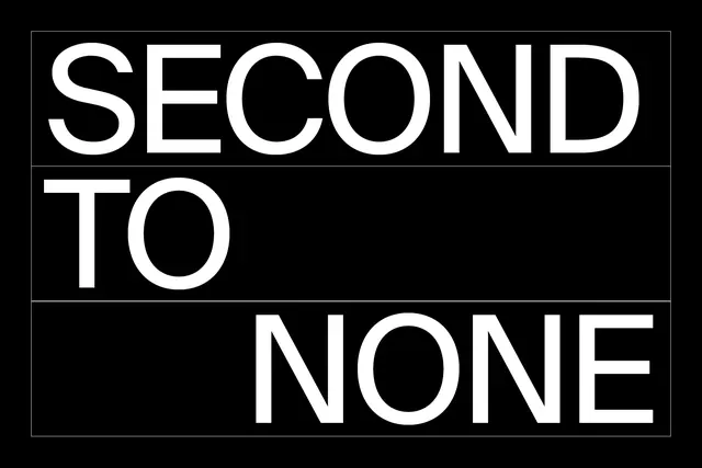
Three-line composition with aggressive sans-serif type stacked vertically, each word separated by crisp horizontal lines, rendering "SECOND / TO / NONE" in white on pure black.
Summary
A bold typographic composition in three stacked rows spelling a motivational statement. Clean white sans-serif type separated by crisp dividing lines on pure black background.
Visual description
Three horizontal sections, each containing a single word in all-caps aggressive sans-serif: "SECOND" (top), "TO" (middle), "NONE" (bottom). Words are separated by thin white horizontal lines creating a grid-like structure. Pure white type on pure black background creates maximum contrast. Letters are wide and geometric, letterforms modern and geometric. Equal spacing creates rhythm and balance.
Key takeaway
Stacking creates emphasis and allows each word to land with impact. Thin dividers break content into digestible sections while maintaining visual unity. The purity of black and white maximizes legibility and impact.
Reuse notes
Works for brand positioning, motivational messaging, or headers. The all-caps treatment and stacked structure feel sporty, athletic, or competitive. Pairs well with bold brand voices. Clean dividers allow for flexible content arrangements. Can work reversed (black on white) but loses some intensity.
More like this

Keep what you find
A free account saves references to boards and can send you a weekly email of picks based on what you save.
To see every result, go Pro.