
Preview image. Unlock full-res
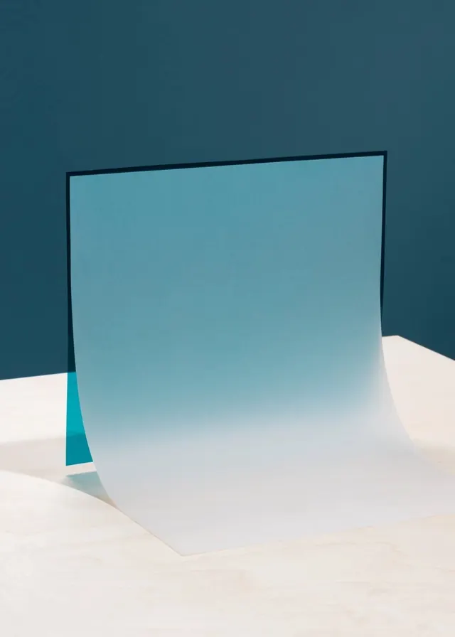
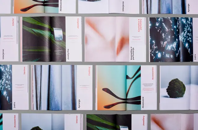
Calming composition dominated by cool soft blue-gray with dark charcoal accents, emphasizing tranquility and minimalism.

Summary
A serene, cool-toned color study emphasizing soft blue-gray as the dominant hue with restrained dark accents for depth and definition.
Visual description
Soft, muted blue-gray (#A9C0C7) covers roughly two-thirds of the composition, creating an inherently calming foundation. Deep charcoal (#2F3738) and slightly warmer blue-gray-teal (#567178) provide minimal but essential contrast and structure. The overall effect is peaceful and understated, likely composed of simple geometric shapes or fields with clean boundaries and generous negative space.
Key takeaway
Demonstrates how cool, muted tones create a sense of calm and professionalism. Shows that visual interest doesn't require saturation or brightness—subtle variation within a cool palette can be equally compelling.
Reuse notes
Strong reference for healthcare design, wellness branding, corporate identity, and any application requiring a calm, trustworthy mood. Works well for apps, websites, and digital products where user tranquility is desired. Pairs effectively with clean typography and minimal imagery.
More like this





Keep what you find
A free account saves references to boards and can send you a weekly email of picks based on what you save.
To see every result, go Pro.