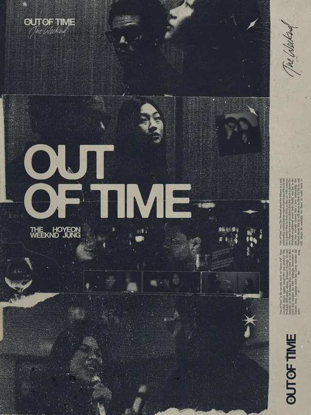
Preview image. Unlock full-res
A refined monochromatic or near-monochromatic design in grayscale tones, demonstrating restraint and elegance through value contrast and subtle form work.
Summary
A refined monochromatic or near-monochromatic design in grayscale tones, demonstrating restraint and elegance through value contrast and subtle form work.
Visual description
The composition demonstrates professional, calm, elegant qualities through its monochrome, light, muted color treatment and minimal, monochrome, photographic design approach. Visual elements are arranged to emphasize restraint and intentional spacing, with careful attention to tonal relationships and formal structure.
Key takeaway
This design exemplifies disciplined use of color and form. The approach shows how fundamental principles of contrast, proportion, and visual hierarchy create sophisticated communication worthy of study and adaptation to other projects.
Reuse notes
Strong reference for projects requiring graphic work with professional sensibilities. The formal approach and palette are particularly useful for branding, editorial, or premium product contexts. Consider adapting the color relationships and compositional strategy for similar professional design applications.
More like this









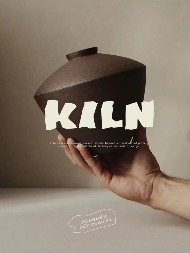
Keep what you find
A free account saves references to boards and can send you a weekly email of picks based on what you save.
To see every result, go Pro.