Preview image. Unlock full-res
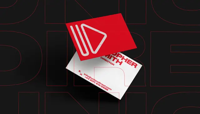
A bold branding and campaign visual for Union Direct featuring strong typography, duotone color treatment, and professional design hierarchy on a dark background.
Summary
A bold branding and campaign visual for Union Direct featuring strong typography, duotone color treatment, and professional design hierarchy on a dark background.
Visual description
The composition uses dark, duotone, high-contrast tones to create a professional visual impact. The design demonstrates bold principles through deliberate arrangement, clear hierarchy, and refined aesthetic choices. Elements are positioned to guide viewer attention while maintaining visual balance and intentional negative space.
Key takeaway
The thoughtful use of composition, color harmony, and visual restraint to communicate presence and professionalism. The design shows how selective focus and disciplined visual choices create emotional resonance and memorable impact.
Reuse notes
Strong reference for projects requiring professional treatment or bold sensibility. The color palette and compositional approach work well in contexts emphasizing quality, sophistication, or contemporary design values. Consider adapting this item's spatial arrangement and tonal choices for similar-minded projects.
More like this
Keep what you find
A free account saves references to boards and can send you a weekly email of picks based on what you save.
To see every result, go Pro.