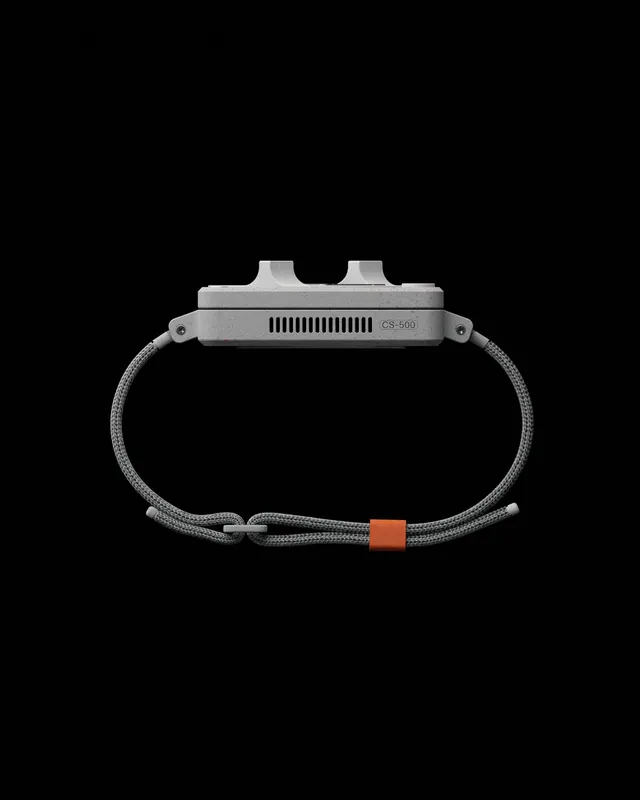
Preview image. Unlock full-res
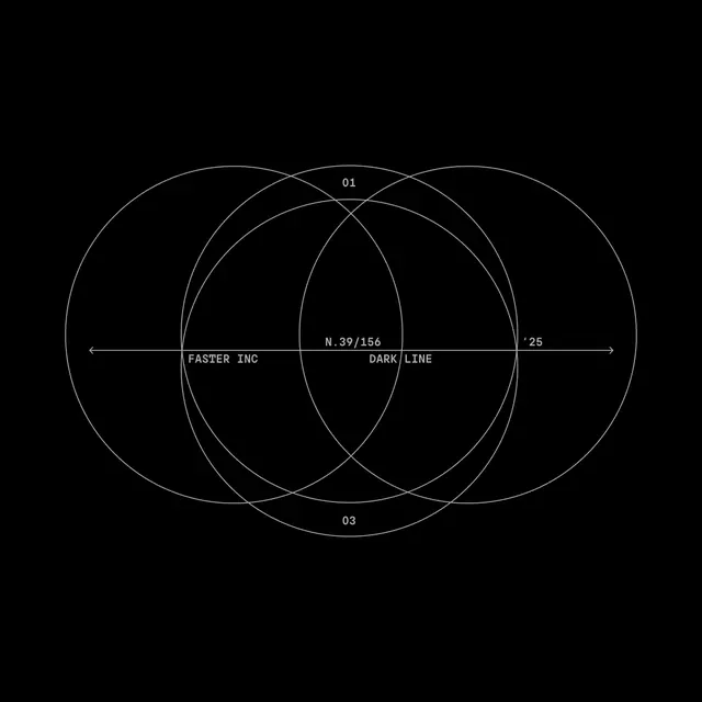
A contemporary digital composition exploring color relationships and transparency through overlapping geometric forms in carefully balanced, subtle color harmonies.
Summary
A refined digital artwork exploring color interactions through layered geometric forms, using a carefully restricted palette of cool, muted tones to create visual harmony.
Visual description
The composition features geometric shapes—circles, rectangles, and irregular polygons—overlapping with varying opacity. The color palette is highly restricted to cool, muted tones with subtle variations in blue-gray and neutral hues. Where shapes overlap, transparency creates new color relationships and subtle color mixing. The composition is balanced but not symmetrical, suggesting visual movement through layering and positioning. Each shape appears precisely rendered with clean edges. The overall effect is sophisticated, technical, and contemplative.
Key takeaway
Color relationships become sophisticated through restraint and transparency. Limiting the palette to close tonal values creates harmony while still allowing visual complexity. Digital transparency enables color interactions impossible in opaque media, adding depth through layering.
Reuse notes
Excellent reference for design system foundations, color theory exploration, or minimalist digital art. The geometric approach applies to UX design patterns, interface design, or motion graphics. The cool, muted palette works for tech products or contemporary branding. Perfect for educational color theory resources or design school projects. Strong inspiration for generative art or algorithmic composition.
More like this



Keep what you find
A free account saves references to boards and can send you a weekly email of picks based on what you save.
To see every result, go Pro.