Preview image. Unlock full-res
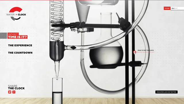
Conceptual diagram of an interactive water-drip timing mechanism with instruction labels and red accent brand color.
Summary
A technical diagram explaining an interactive water-clock mechanism, combining product visualization with instructional typography. The design uses bold red accents against a neutral palette to guide user attention through the system.
Visual description
Landscape-format composition (1095x618px). Left side features brand logo "WATER • CLOCK" with geometric circle and line mark, plus red-filled text label "WHAT TIME IS IT?" and left-aligned black body copy "THE EXPERIENCE" and "THE COUNTDOWN". Center and right show a detailed cross-section illustration of the mechanical system in black and gray: a large circular vessel, internal mechanisms including springs and a dripping nozzle, directional arrows. Bottom right has red instruction text "DRAG TO SEE THE CLOCK" and hashtag prompt. A red horizontal stripe spans the top edge. The background is off-white with generous spacing.
Key takeaway
Effective use of a single accent color (red) and clear information hierarchy (logo, action labels, mechanical diagram) to communicate a complex interactive product in one frame. The balance of illustration and typography creates both aesthetic interest and functional clarity.
Reuse notes
Excellent reference for interactive product concepts, installation art documentation, or educational diagrams. The logo treatment and color system suit contemporary design studios or tech companies wanting a friendly, technical aesthetic. Works well for educational campaigns or exhibition materials. The sans-serif typography and red accent pair well with minimalist, Scandinavian, or Swiss design directions.
More like this
Keep what you find
A free account saves references to boards and can send you a weekly email of picks based on what you save.
To see every result, go Pro.