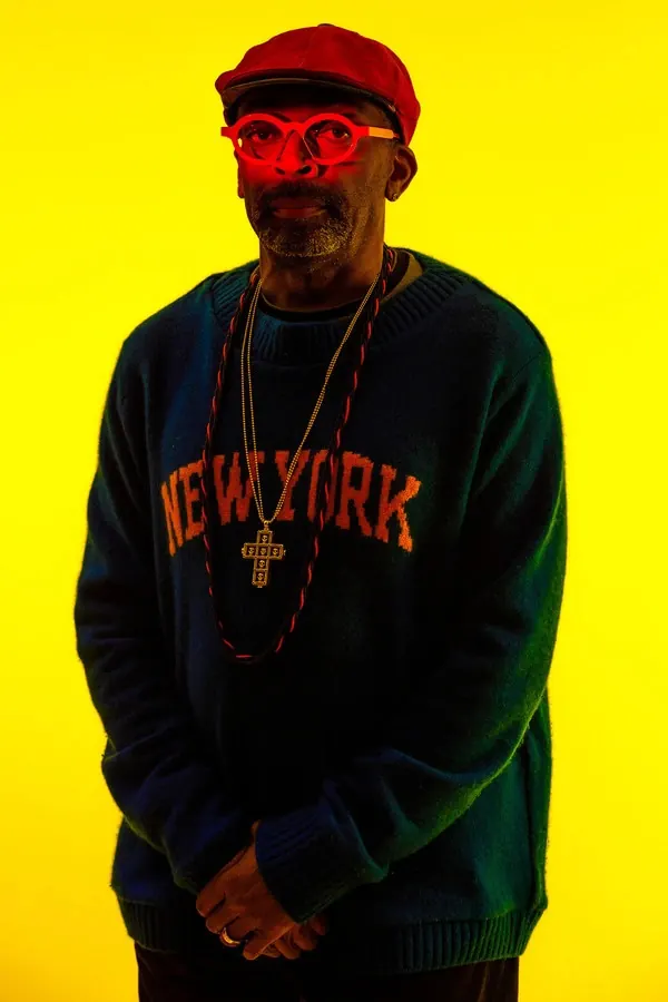
Preview image. Unlock full-res
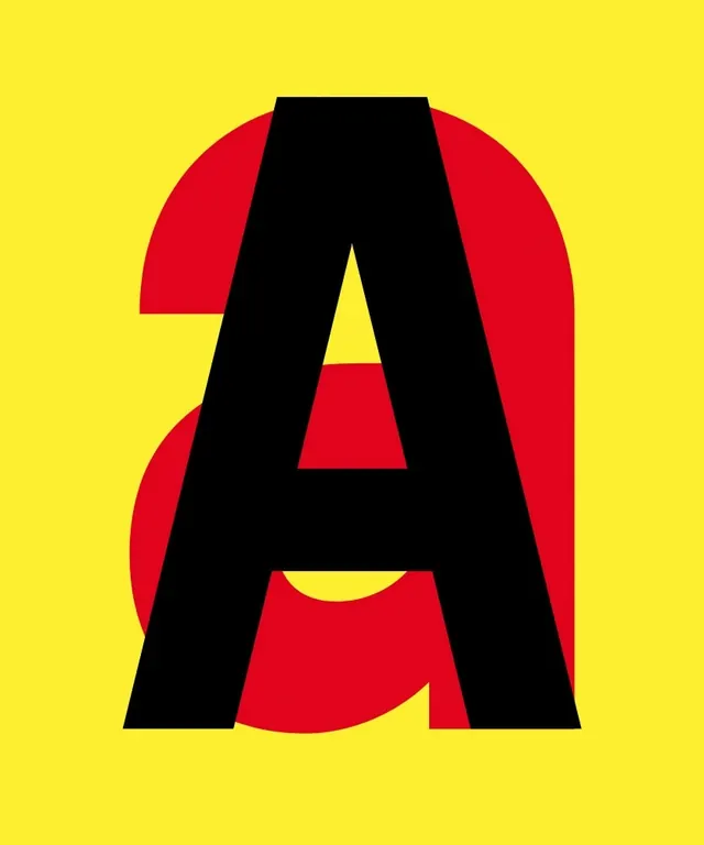
Striking branding composition using intense yellow and red accents against deep black for maximum visual impact.
Summary
A dramatically contrasted branding statement combining jet black, hot yellow, and deep red-orange. The bold color combination demands attention.
Visual description
Near-black background serves as the dominant color. Brilliant hot yellow type or graphic elements create primary visual impact. Deep wine-red or rust accents add secondary emphasis. The contrast is intentionally jarring and energetic. Typography is bold and large, rendered in clean geometric sans-serif. The composition feels technological and high-energy.
Key takeaway
Extreme contrast and neon-level saturation can convey boldness and modernity. This palette works best for brands that want to disrupt or stand out dramatically.
Reuse notes
Excellent for startups, tech companies, or brands wanting edgy presence. Works well in competitive markets where standing out is critical. The intensity of this palette limits applications—best used sparingly or for specific sections/accents rather than entire identity systems. Pairs well with minimalist UI design as a accent system.
More like this



Keep what you find
A free account saves references to boards and can send you a weekly email of picks based on what you save.
To see every result, go Pro.