Preview image. Unlock full-res
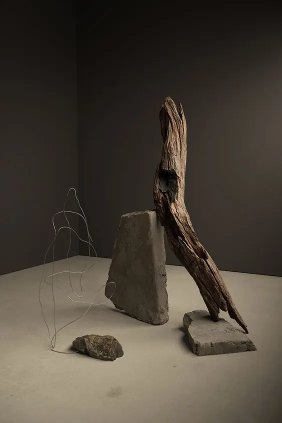
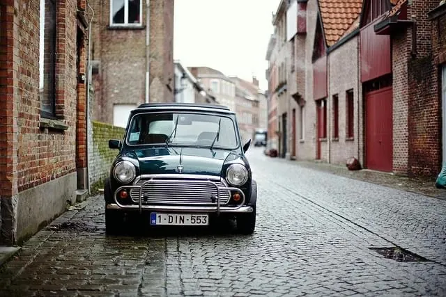
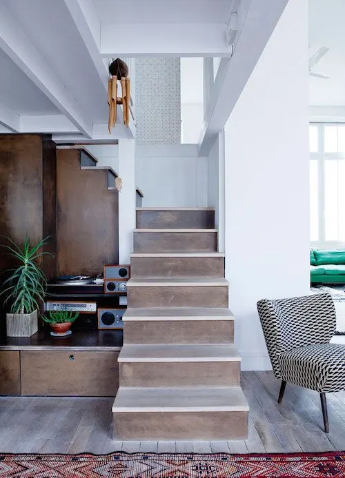
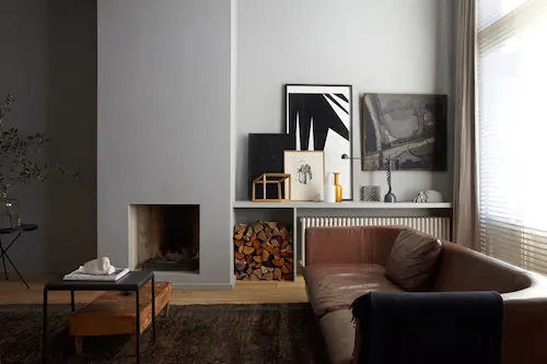
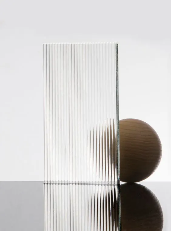
A square-format design in warm taupes and mauves, creating a soft, sophisticated palette through cool-warm neutral balance.
Summary
A warm-toned composition using soft taupes and mauves, creating visual warmth and sophistication through a restricted palette of neutral tones.
Visual description
The palette centers on warm taupe (#B5AEAF) and dusty mauve tones, grounded by deep burgundy-brown accents. The muted saturation and warm undertones create a sophisticated, inviting mood. Subtle tonal transitions and the square format suggest balanced, contemplative composition.
Key takeaway
Mauve and taupe undertones convey warmth and sophistication without relying on bright color. The balance of warm neutrals creates visual richness through tonal variation alone.
Reuse notes
Suitable for premium, luxury, wellness, and fashion contexts. The soft, inviting palette works well with elegant typography and organic shapes. Particularly effective for meditative, calming, or contemplative brand narratives.