Preview image. Unlock full-res
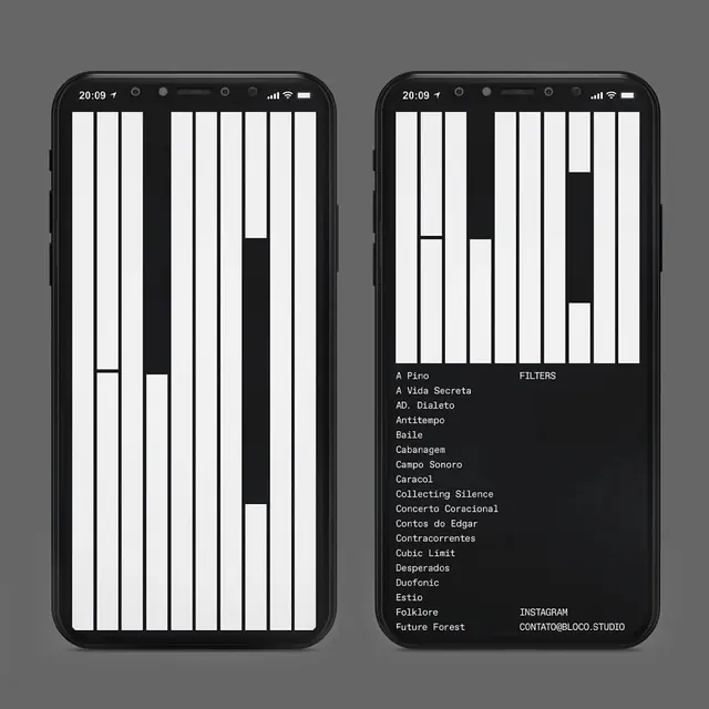
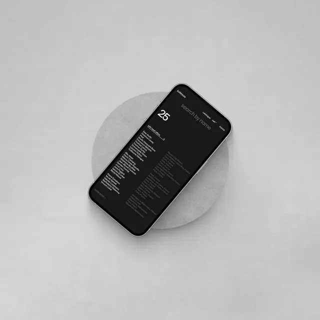
Dual-screen mobile UI mockup showing a music filter interface with abstract bar visualization and an alphabetical genre/playlist list.

Summary
A mobile music streaming interface displayed across two iPhone mockups, showing a filter system with abstract bar graph visualization on the left and a genre/playlist listing with metadata on the right.
Visual description
The left screen shows a grid of vertical bars in varying heights, suggesting audio frequency or popularity distribution. One bar is highlighted, indicating current selection. The right screen displays an alphabetical list of music genres and playlist titles ("A Pino", "A Vida Secreta", "AD. Dialeto", etc.), with a "FILTERS" header and a secondary "INSTAGRAM CONTATO@BLOCO.STUDIO" section below. Both screens use black backgrounds with white text and interface elements. The overall aesthetic is minimal and technical, with clean typography and simple geometric shapes.
Key takeaway
Using abstract visualization (bar graphs) to make filter selection intuitive and visually interesting. The two-screen composition efficiently shows both the selection interface and the resulting list in a single glance.
Reuse notes
Strong template for music, podcast, or content streaming apps. The bar visualization can be adapted to show any quantitative data (popularity, duration, year). Works well for dark-themed interfaces in entertainment, fitness, or productivity apps. The minimalist approach prioritizes content discovery over visual embellishment.
More like this



Keep what you find
A free account saves references to boards and can send you a weekly email of picks based on what you save.
To see every result, go Pro.