Preview image. Unlock full-res
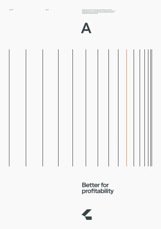
Clean, minimal poster design featuring an oversized letter "A" and a field of vertical lines with a single accent line, paired with the headline "Better for profitability.
Summary
A minimalist poster design combining oversized typography with abstract linear elements. The composition uses a grid of vertical lines with one highlighted accent line to create visual rhythm and data-driven aesthetic.
Visual description
A dominant, centered letter "A" in a large sans-serif typeface sits above a dense grid of evenly-spaced black vertical lines on a white background. One line among the grid is colored a bright orange-red, creating focal emphasis. Below the grid is the headline "Better for profitability" in a clean, contemporary sans-serif, left-aligned. Small navigation labels ("Align", "Belief") appear in the top corners.
Key takeaway
Using simple geometric elements—here, a grid of lines—to suggest data, systems, and precision. The single accent line demonstrates how a minimal color intervention can draw attention in an otherwise monochrome composition.
Reuse notes
Strong template for fintech, data, or SaaS brands seeking a clean, technical aesthetic. The vertical line motif works well to suggest growth, efficiency, or analysis. Pairs naturally with bold typography and minimal color palettes. Works at any scale, from poster to digital interface.
More like this

Keep what you find
A free account saves references to boards and can send you a weekly email of picks based on what you save.
To see every result, go Pro.