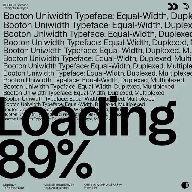
Preview image. Unlock full-res
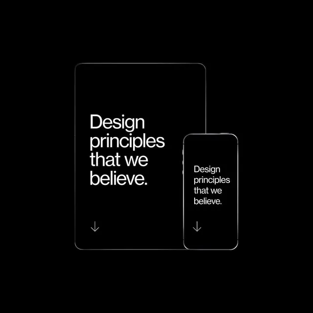
Graphic or newsletter design built on a high-contrast dark palette (60% near-black, 37% light gray) with minimal mid-tone detail.
Summary
A square newsletter or graphic design showcasing dark-mode composition: near-black background (60%) balanced by light gray (37%), with minimal mid-tone gray accents creating structure and hierarchy.
Visual description
Large square format (2250x2250, 1:1). Dominated by very dark charcoal-black (60%), creating a strong, modern base. Light gray (37%) elements—likely text, dividers, or content blocks—provide stark contrast and readability. Subtle mid-tone grays (1.7%) add refinement and prevent the design from feeling purely binary. Displaay newsletter context suggests editorial/design publication aesthetic.
Key takeaway
Dark-mode layouts gain sophistication through the addition of subtle mid-tones: pure black + white alone feels harsh, but near-black + light gray + carefully-placed mid-grays creates depth and visual refinement. The square format emphasizes symmetry and balance.
Reuse notes
Excellent reference for dark-mode design systems, dark newsletter templates, or modern digital product layouts. The square format is ideal for social media, app screens, or portfolio presentations. Displaay origin (a design publication) signals use in contemporary design editorial, digital marketing, and creative direction. Strong for dark-themed SaaS, tech branding, or any design seeking a bold, modern aesthetic. High contrast makes this layout work at all sizes and on any background.
More like this
Keep what you find
A free account saves references to boards and can send you a weekly email of picks based on what you save.
To see every result, go Pro.