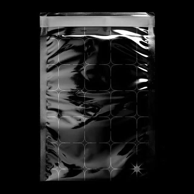
Preview image. Unlock full-res
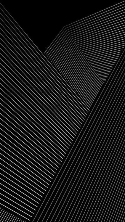
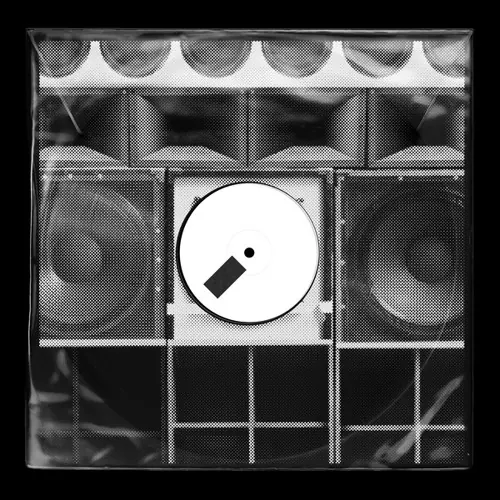
Black-and-white square composition with strong contrast between near-pure black and light gray tones.
Summary
A square monochromatic composition balanced between near-black (48%) and light gray (41%), with intermediate grays providing tonal gradation. Title "déjàvu" suggests conceptual depth beyond the geometric/abstract forms.
Visual description
Predominantly pure black and light gray, with subtle mid-tone grays creating visual depth and transition. The square format (1:1) gives the composition inherent stability. The strong contrast between extremes (0A0A0A to A6A6A6) creates a striking graphic presence while the intermediate grays soften the harshness and add sophistication.
Key takeaway
Extreme contrast in a limited palette yields maximum impact with minimal complexity. The near-black and near-white endpoints alone would feel harsh; the mid-tones create visual refinement and breathing room. The square frame forces balance and symmetry in composition.
Reuse notes
Excellent reference for poster work, bold editorial design, abstract geometric systems, or high-impact backgrounds. Tumblr aesthetic origins suggest use in contemporary art/design contexts. The square ratio is useful for social media, album art, or any confined layout requiring visual density and immediate recognition.
More like this
Keep what you find
A free account saves references to boards and can send you a weekly email of picks based on what you save.
To see every result, go Pro.