Preview image. Unlock full-res
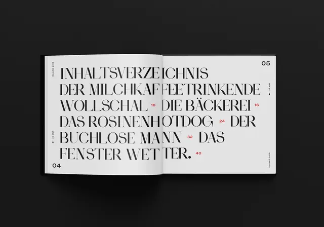
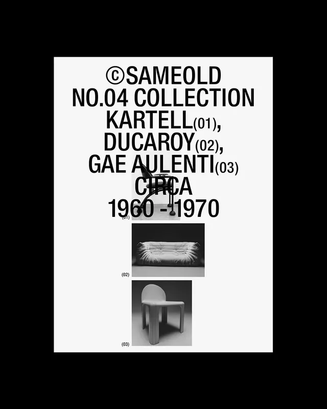
A minimalist typographic composition featuring German text arranged in a structured, justified block with numerical markers.
Summary
A minimalist typographic composition featuring German text arranged in a structured, justified block with numerical markers.
Visual description
Black text on a white rectangular card against a solid black background. The layout uses a justified block of all-caps sans-serif type with small numerical indicators in the corners.
Key takeaway
Demonstrates how high-contrast, justified typography can create a strong architectural and structural feel.
Reuse notes
Use as a reference for minimalist editorial layouts or high-impact typographic posters.
More like this
Keep what you find
A free account saves references to boards and can send you a weekly email of picks based on what you save.
To see every result, go Pro.