Preview image. Unlock full-res
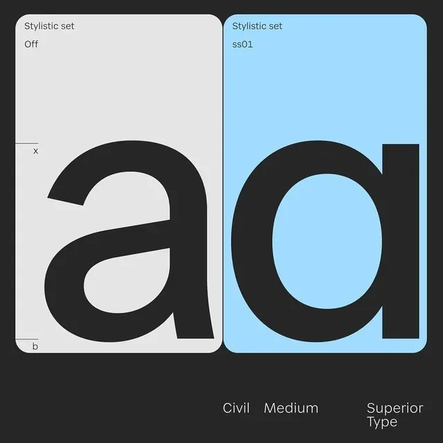
A comparative layout showing two stylistic variations of a lowercase 'ad' character set.
Typesans-serif, oversized, all-caps
Palette
#A2D6F5
#252526
#E3E3E3
Summary
A comparative layout showing two stylistic variations of a lowercase 'ad' character set.
Visual description
Two side-by-side vertical panels display the letters 'ad' in heavy black weights. The left panel is light grey with a thin border, while the right panel is light blue with a thick border.
Key takeaway
Demonstrates the visual weight and stylistic differences between 'Off' and 'sd01' font sets.
Reuse notes
Use as a reference for font weight selection and stylistic consistency in typography projects.
More like this
Keep what you find
A free account saves references to boards and can send you a weekly email of picks based on what you save.
To see every result, go Pro.