Preview image. Unlock full-res
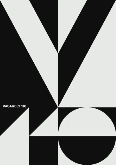
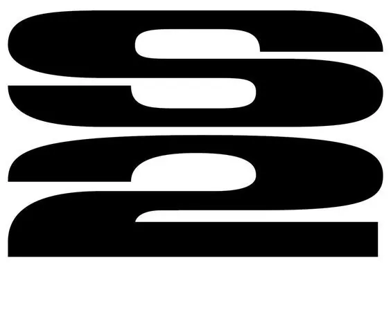
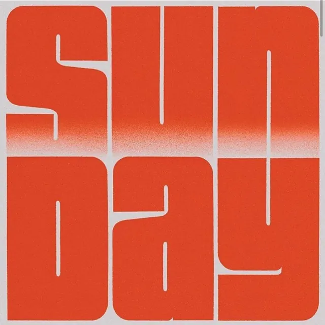
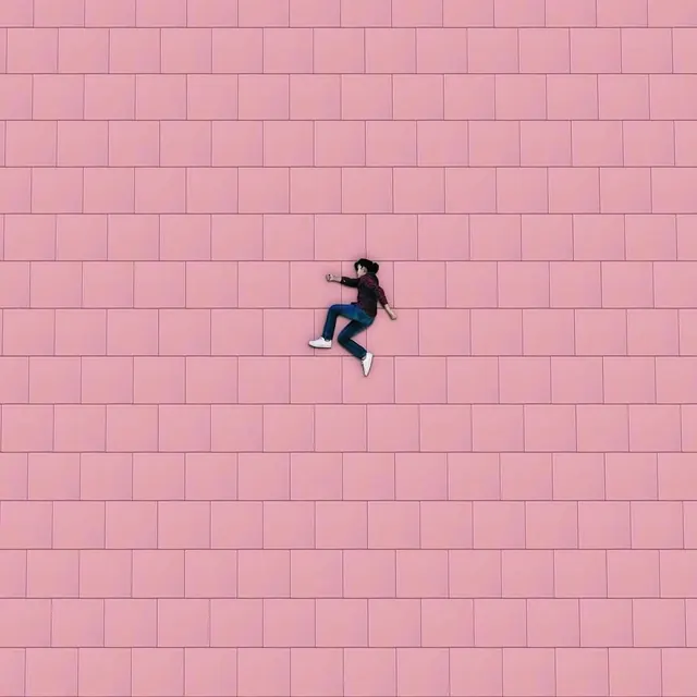
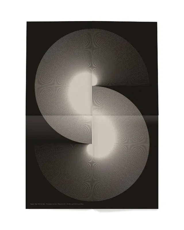
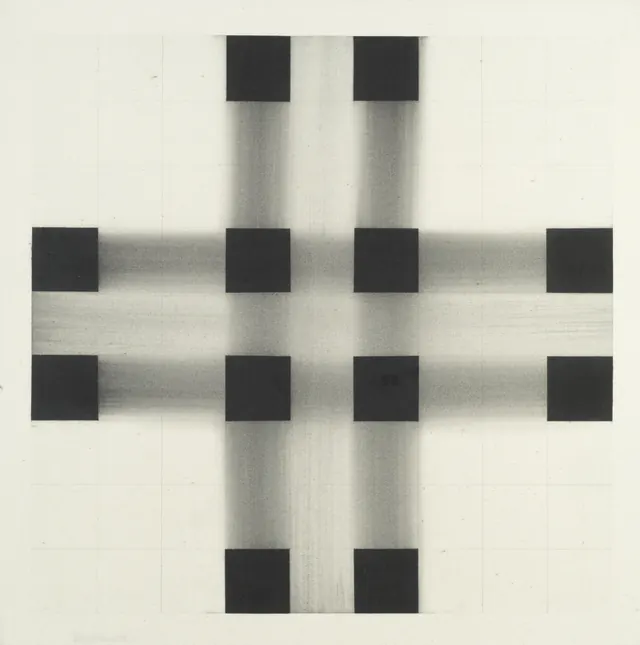
An abstract visual composition emphasizing form, line, and minimal color relationships in a geometric arrangement.
Summary
A minimalist abstract composition that explores geometric form and spatial relationships using restraint in both shape and color. The piece emphasizes the clarity of line and the precision of geometry over decoration.
Visual description
The image features simple geometric shapes—likely lines, rectangles, or circles—arranged in a balanced composition against a neutral background (white, light gray, or similar). The color palette is highly restricted, using only one or two neutral or muted tones alongside the background. The shapes are clean and precise, with sharp edges, suggesting digital creation or careful hand-work. There is no text, decoration, or representational imagery. The arrangement feels intentional and balanced, with negative space playing an active role in the composition.
Key takeaway
Geometric precision and negative space as design principles. The work demonstrates that visual interest need not come from color or complexity—form, rhythm, and careful spatial relationships are sufficient. This is distilled design thinking.
Reuse notes
Excellent as a reference for minimalist branding, grid-based design systems, or contemporary art direction. The principle of "say more with less" translates well to app UI, editorial grids, or logo concepts. The neutral color allows for easy adaptation to different brand palettes while retaining the formal rigor.