Preview image. Unlock full-res
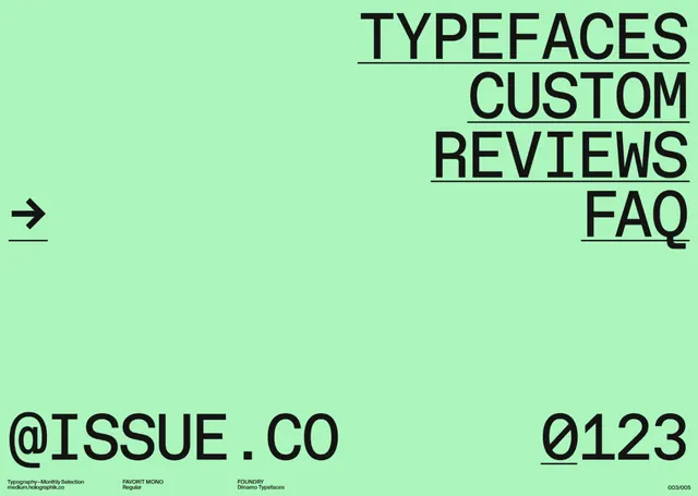
A vibrant mint background with bold black type and navigation elements promoting custom font reviews.
Summary
A poster design featuring bold black sans-serif and monospace type on a bright mint green background. Navigation elements and section headings (TYPEFACES, CUSTOM, REVIEWS, FAQ) are arranged asymmetrically with underlines.
Visual description
Bright, saturated mint-green background fills the entire composition. Large black sans-serif text reading "TYPEFACES CUSTOM REVIEWS FAQ" is stacked and arranged with generous negative space. Each word is underlined in black, creating rhythmic visual separation. A simple left-pointing arrow appears on the left side in black. Bottom corner credits read "@ISSUE.CO" and "0123" in monospace and sans-serif. The layout is deliberately unaligned—type floats at different horizontal positions, creating dynamic movement while maintaining clarity through high contrast and white space.
Key takeaway
A single, highly saturated background color becomes the hero—no additional imagery needed. Underlines create cohesion without being decorative; they function as both visual element and navigation aid. Asymmetrical arrangement of type adds modern, contemporary energy without sacrificing readability.
Reuse notes
Powerful reference for type-focused design work, especially specifications and design tools. The bright single color makes it memorable and shareable. Works for any service promoting type systems, custom fonts, or design tools. The layout technique adapts easily to dark backgrounds and other bright accent colors. Effective for screen and print applications alike.
More like this


Keep what you find
A free account saves references to boards and can send you a weekly email of picks based on what you save.
To see every result, go Pro.