Preview image. Unlock full-res
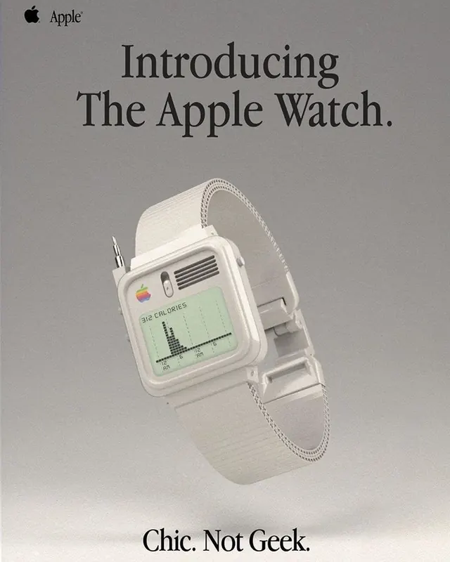
A product mockup for the first-generation Apple Watch positioned at a three-quarter angle, featuring a white sport band and display showing a health metrics graph, with minimal type callouts.
Summary
A sophisticated product announcement for the Apple Watch rendered in neutral tones, showcasing the device from a dynamic angle with branded callouts emphasizing style over technical specification.
Visual description
A polished three-quarter view of the first Apple Watch sits center-frame against a soft neutral background. The white sport band drapes naturally, and the square face displays a green health metrics graph. The composition emphasizes premium minimalism: the Apple logo sits in the upper left corner in modest typography. Large serif type announces "Introducing The Apple Watch" as a headline, with smaller serif copy reading "Chic. Not Geek" at the bottom, directly addressing positioning strategy through language. The entire palette remains in warm, muted neutrals—beiges, taupes, soft blacks—avoiding the typical tech-industry cool tones.
Key takeaway
Positioning the product announcement around lifestyle and cultural positioning (the "chic not geek" tagline) rather than features or specs. The warm, soft palette and refined serif typography signal premium design thinking rather than technical innovation.
Reuse notes
Strong approach for consumer product launches where market positioning matters as much as feature set. The warm, approachable color palette works well for mainstream consumer audiences. The serif typography choice subtly elevates the product category. Works especially well for wearables, lifestyle tech, and products bridging fashion and function.